“This is the nature of modern death,” Murray said. “It has a life independent of us. It is growing in prestige and dimension. It has a sweep it never had before. We study it objectively. We can predict its appearance, trace its path in the body. We can take cross-section pictures of it, tape its tremors and waves. We’ve never been so close to it, so familiar with its habits and attitudes. We know it intimately […] I sense that the dead are closer to us than ever. I sense that we inhabit the same air as the dead. Remember Lao Tse. ‘There is no difference between the quick and the dead. They are one channel of vitality.’ He said this six hundred years before Christ. It is true once again, perhaps more true than ever.”
- Don DeLillo, White Noise
Context
My motivation for this project was to get practice exploring a large, messy government dataset, and communicating the results in clear visualizations, which are both skills I care about improving. Since I live in the US, and since I’m interested in public health, US mortality data seemed like a good fit. We’ll be building up to making the headline chart above, and then continue on to answer a handful of other questions I have about what the statistical shape of death is in the US.
About the data
Each year the National Vital Statistics System (NVSS) releases a dataset containing information about every recorded death in the US that year. The NVSS is run by the National Center for Health Statistics (NCHS), which is a division of the Centers for Disease Control and Prevention (CDC), which is in turn part of the U.S. Department of Health and Human Services (how deep does it go?). The mortality datasets are finalized approximately one year after the target year, and some time after that the National Bureau of Economic Research (NBER) publishes a CSV of the data which I have found much easier to work with. I will be working with the 2024 Multiple Cause of Death Data, the most recent year there is finalized data for. To reduce complexity I have not included the US territories as part of this analysis, which would require a separate dataset. Also, I have constrained the analysis to residents to match CDC methodology.
I am also using a couple other supplementary datasets. For 2024 population by age I am using the 2024 data from Annual Estimates of the Resident Population by Single Year of Age and Sex for the United States: April 1, 2020 to July 1, 2025 from census.gov, and for historical life expectancy data I am using the Human Mortality Database.
Throughout this analysis I convert some NCHS labels to simplified and/or shortened one to make them more comprehensible and fit them into the charts better. For example, I change “Nephritis, nephrotic syndrome and nephrosis” to “Kidney disease”, and “Congenital malformations, deformations and chromosomal abnormalities” to “Birth defects”. I’ve done my best to do these conversions without loss in accuracy. You can find the full list of these conversions in this label mappings file.
The analysis and visualizations were done in Python with the pandas and matplotlib libraries, and color blindness accessibility was checked with the wonderful let’s get color blind firefox extension.
Initial Exploration
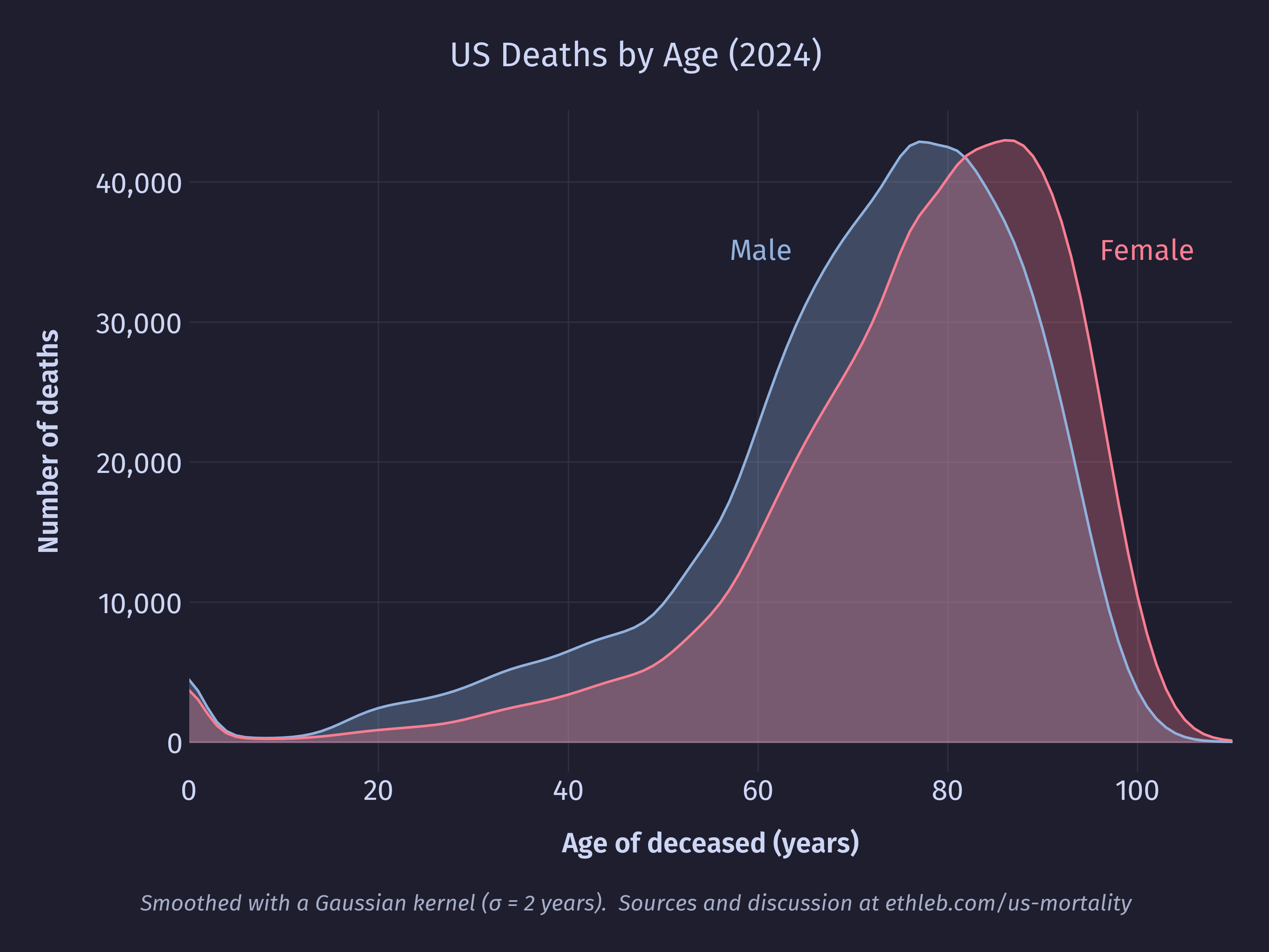
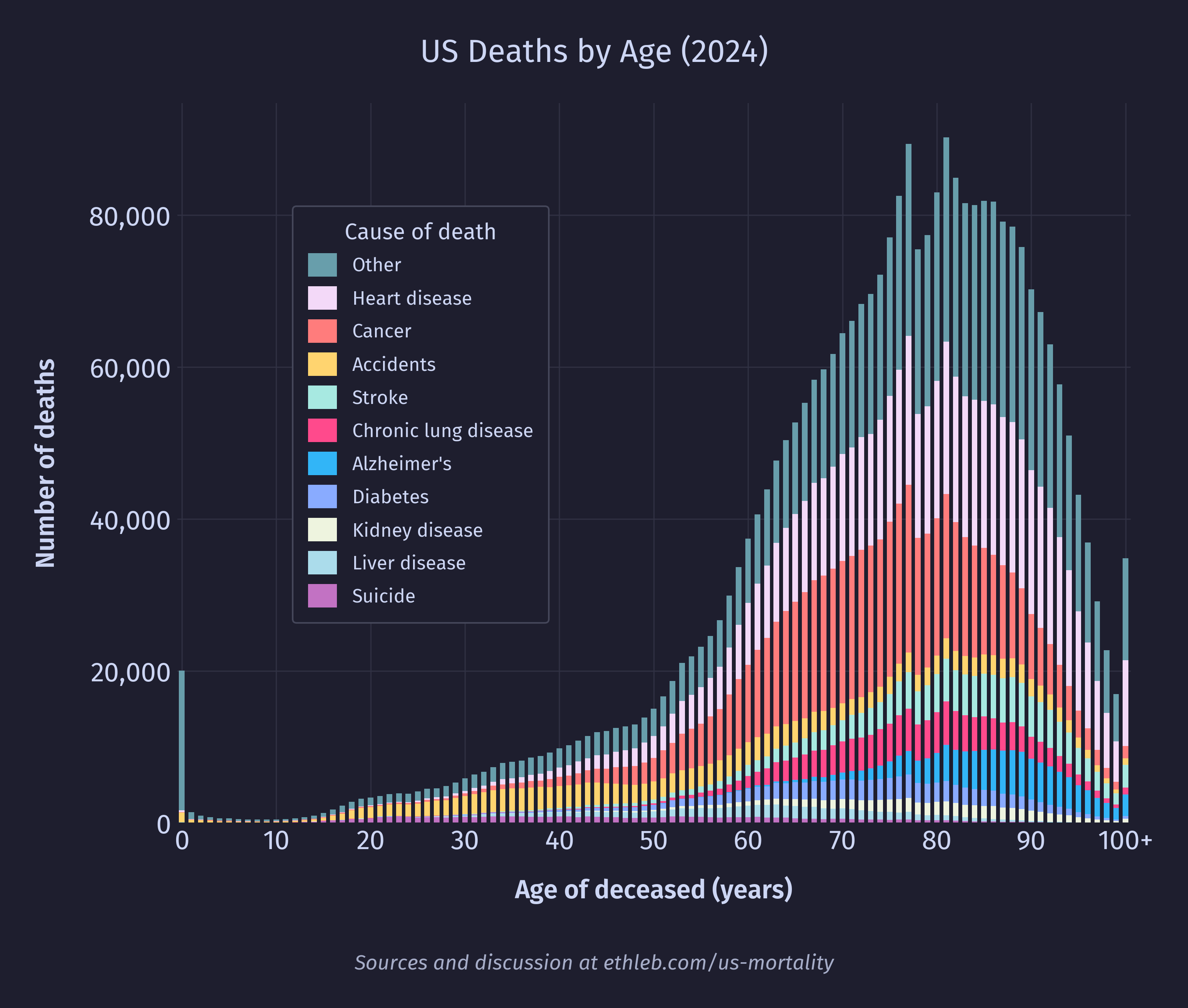
The data I am working with contains records of 3,072,666 deaths. Unsurprisingly most of the deaths are happening in old age, with 82% of deaths occurring after the age of 60, and the total number of deaths peaking at 81 with 90,239 deaths. The median age of death was 77 (80 for females, 74 for males), and the mean was 73.5 (76.5 for females, 70.5 for males). We can see the difference in male and female ages of death in this smoothed area chart of the data:
The mean age of death is dragged lower than the median by the large number of outlier deaths in infancy. We can see this in the spike of 20,050 first year deaths at the far left of the histogram below which shows deaths per age.
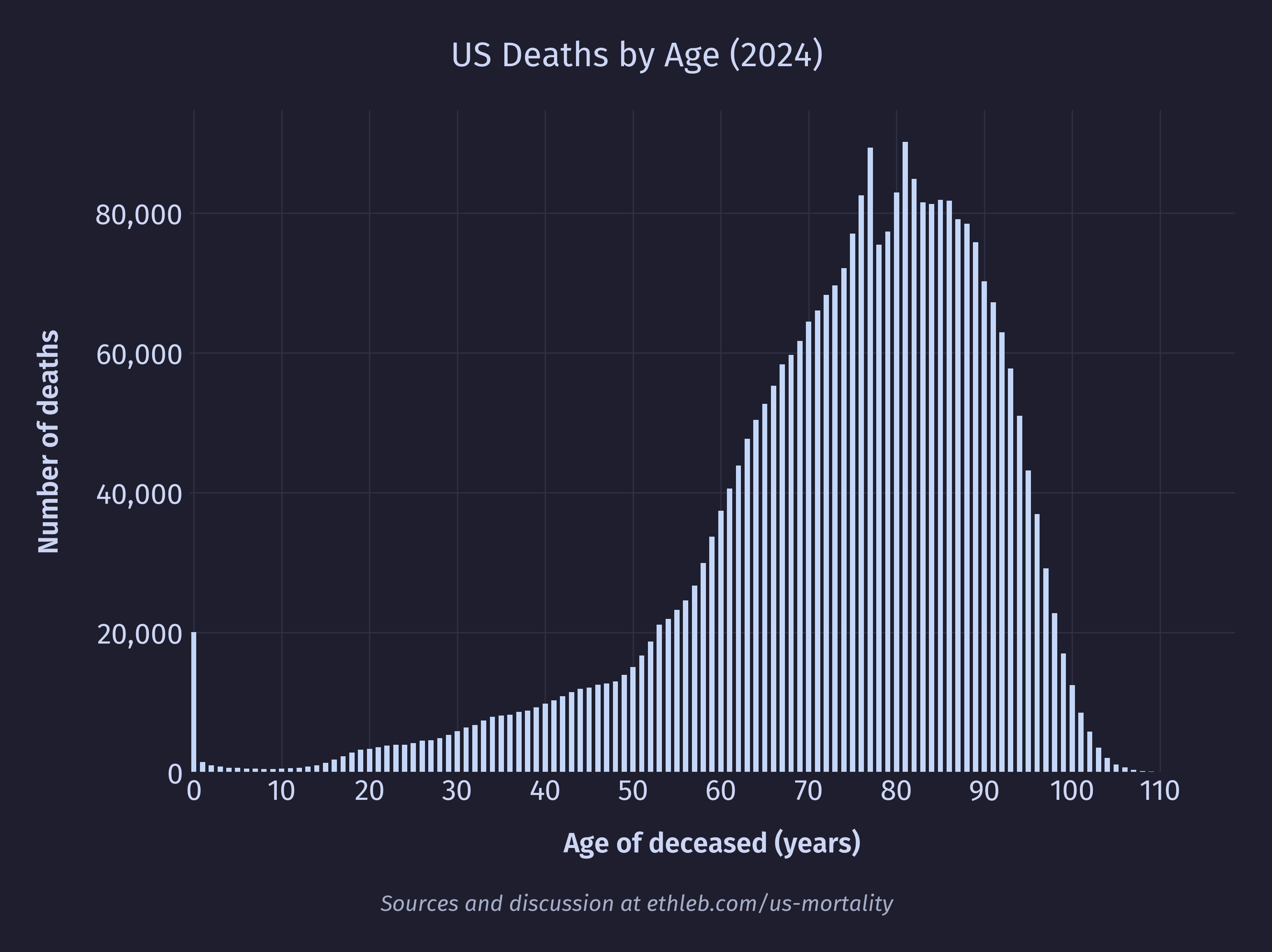
There are two other notable spikes on the chart, around ages 77 and 81. We can see in the graph of the US population below a corresponding spike in the population at age 77. At 81 there isn’t a spike, so much as a stall in the otherwise smooth population decline.
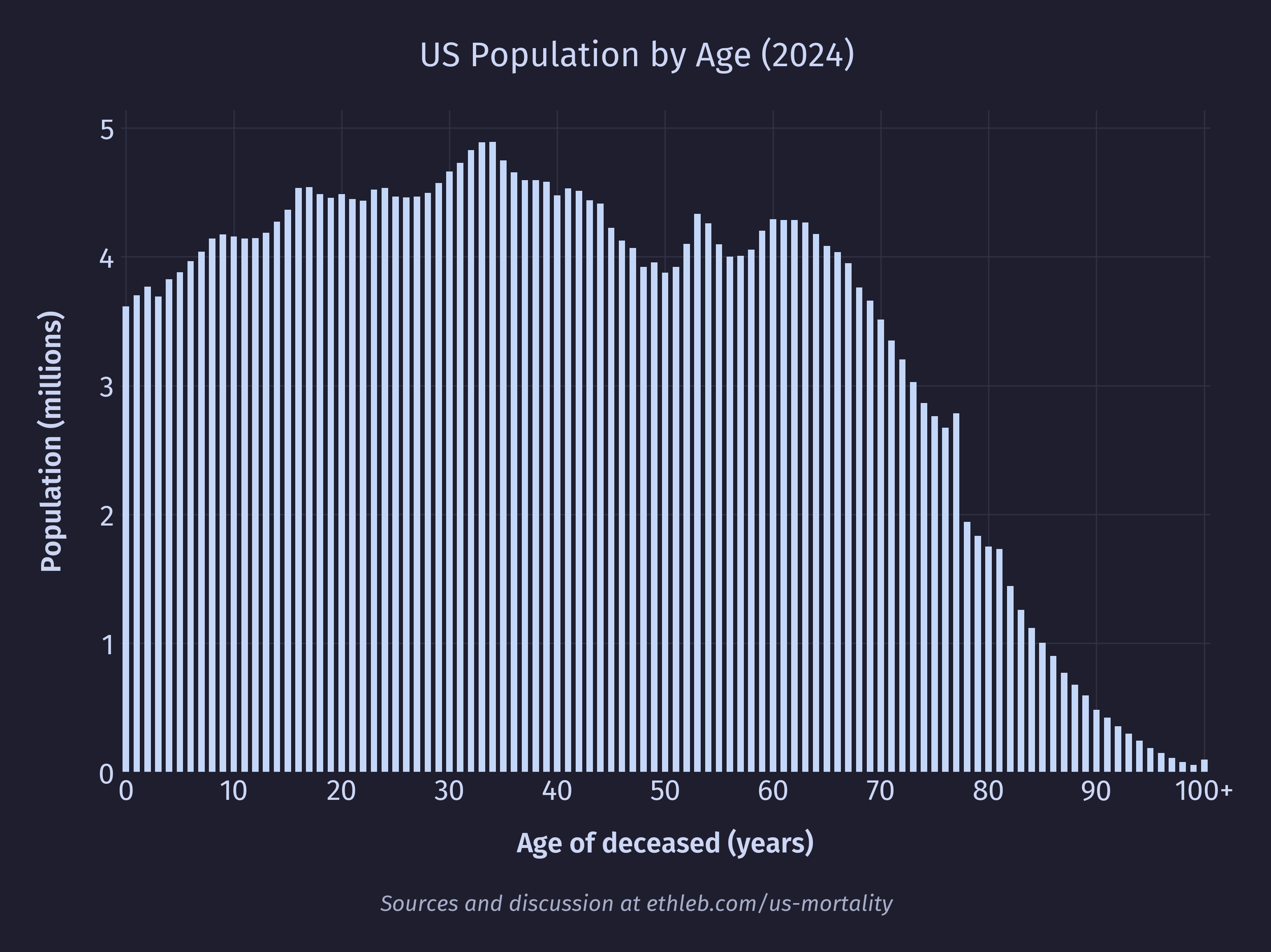
77 and 81 year olds in 2024 would have been born in 1947 and 1943 respectively. 1943 aligns with the boom of “furlough” babies conceived during a soldier’s leave just before deployment as the US joined World War II. 1947 aligns with the post-war baby boom after soldiers returned home. The presence of larger populations at these ages mean there are more people to die, leading to spikes in death.
So why don’t we see such dramatic spikes in death corresponding to other population spikes, many of which are larger than the spikes at 77 and 81? The answer lies in mortality rates. If we divide the number of deaths at a given age by the US population at that age and multiply by 100,000 we get deaths per 100,000 people. After doing that for each age we get this chart of mortality rates per age:
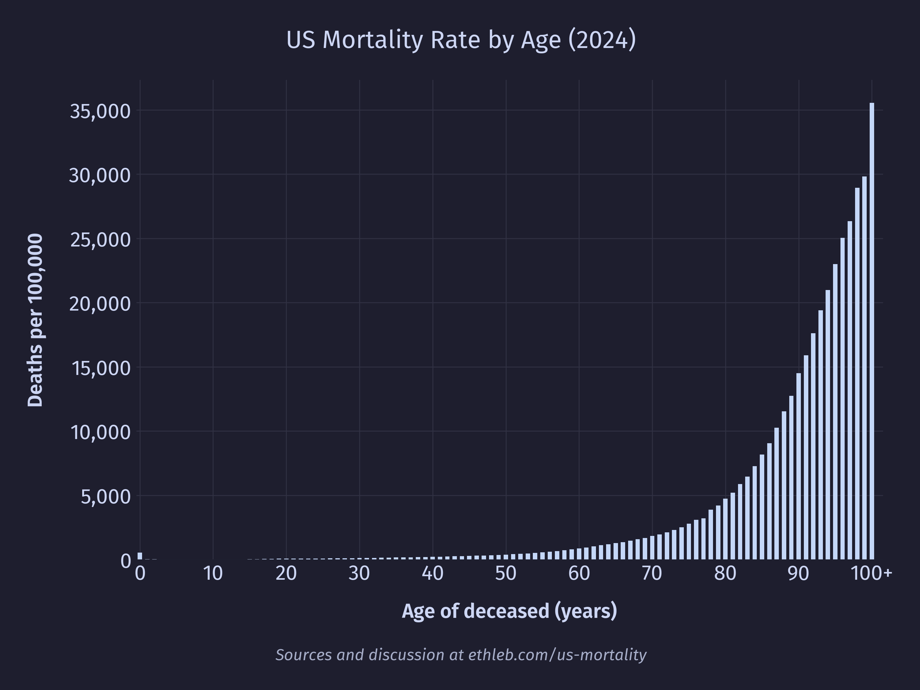
If our spikes were caused by there being something particularly dangerous about being 77 or 81 then we should see that reflected in a higher mortality rate for these ages, but we don’t. In fact, the bumpyness of the population and the bumpyness of the raw death counts cancel each other out to produce this (almost) perfectly smooth curve! This isn’t a coincidence, we’ve just deconstructed the data by moving in the opposite direction that nature moved to construct it in the first place. The raw death counts can be thought of as a function of the population size multiplied by the mortality rate. For example, the number of 80 year olds who died in 2024 is equal to the number of 80 year olds in the population multiplied by the mortality rate of 80 year olds. Now with these pieces of the puzzle we can see why only the 77 and 81 year old spikes appear in the death data. Younger portions of the population have massively lower mortality rates, which blunts the effect of fluctuations in the population on the final death count.
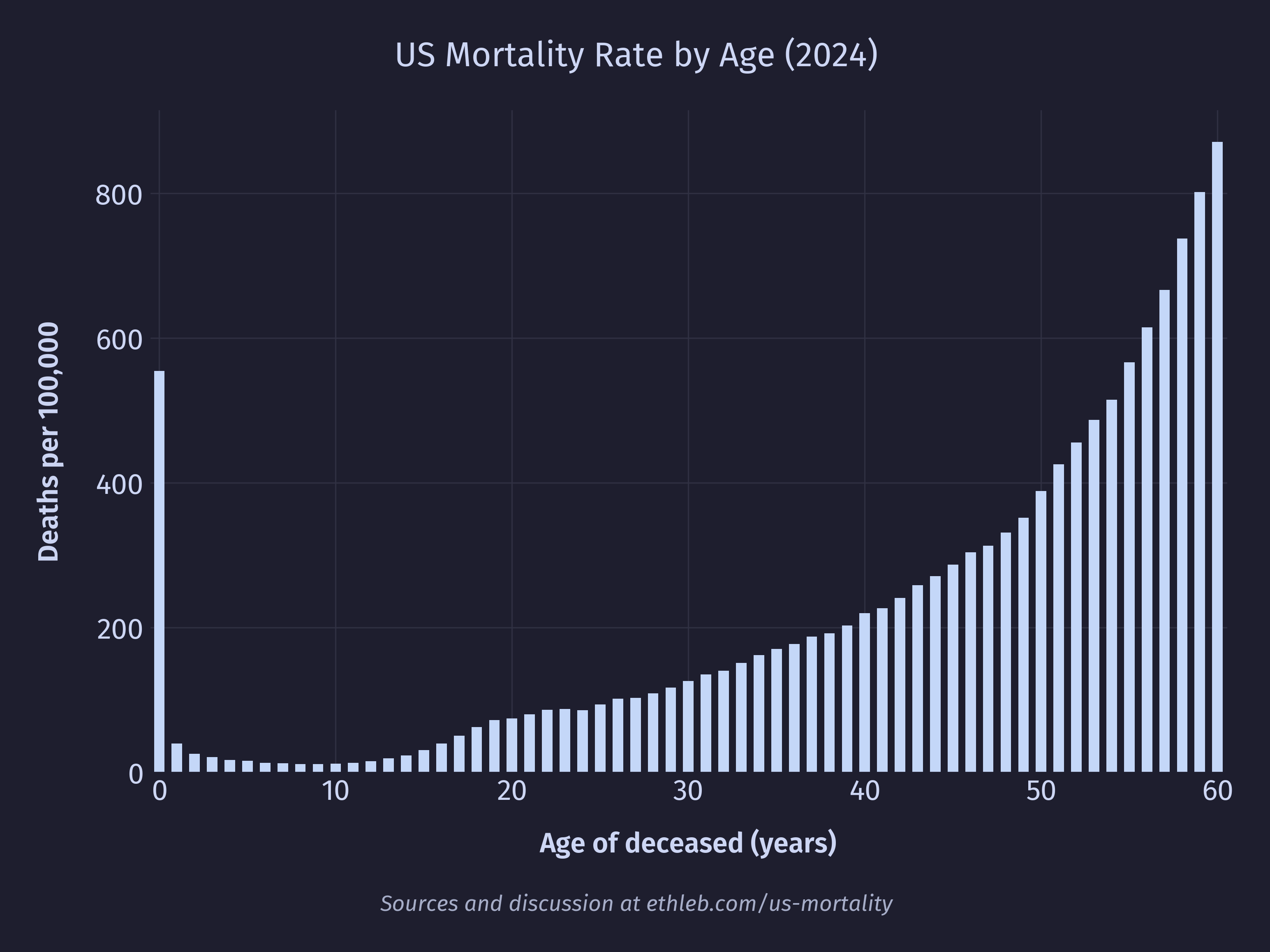
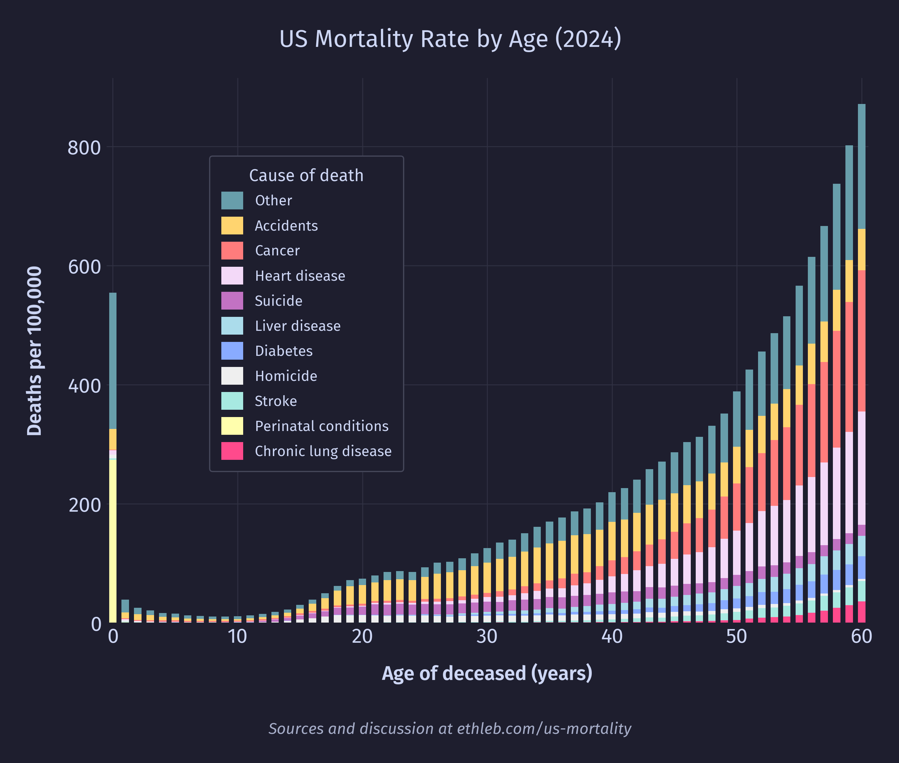
So, we can see that the spike in deaths at 77 and 81 are caused by fluctuations in the population, but what about the spike at age 0? We can see in the population data that the number of 0 year olds is actually lower than the number of 1 year olds, so in this case the higher death rate isn’t caused by a larger population. Cropping the mortality rate by age chart to exclude the large values in very late life, we can see that 0 year olds have a significantly elevated mortality rate of 555 deaths per 100,000 (a rate their cohort won’t see again until they’re 55).
We’ll take a closer look at infant mortality later in this article.
Life Expectancy
I was surprised to see both the mean and median age of death to be so far below the figures I’ve heard for US life expectancy, which the CDC reported at 79 for 2024. My understanding is that official life expectancy calculations are done by averaging the lifespans of an imaginary cohort of infants born in 2024, assuming 2024 mortality rates per age remain constant. This is equivalent to averaging the age of death in a single year for an imaginary population where the same number of people were born each year, and where there have only ever been 2024 mortality rates.
There are at least two forces in the real world data that push our population younger than the synthetic one described above. First, historically decreasing mortality rates (meaning mortality rates were higher in the past) mean that fewer old people are alive in the population today than if they had spent their whole lives living with 2024 mortality rates because more of them would have been filtered out at younger ages when mortality rates were higher. Second, our population is growing because more young people have been added to the population each year recently (mostly through immigration in the US) than were added in the past. Both these forces push the age of the US population younger. More young people means more young deaths, and fewer old people mean fewer old deaths, so the average age of death gets pushed younger. In summary, a growing population and higher mortality rates in the past leads to younger populations today and more young deaths relative to old deaths than we would expect in the future from a cohort born today where we hold mortality rates constant and population static.
Here is how life expectancy in the US has changed since 1933 for infants and 10 year olds. Life expectancy is higher for 10 year olds because they have already made it past the hazards of infancy. The shrinking of that gap over time points to significant progress reducing infant mortality in the US.
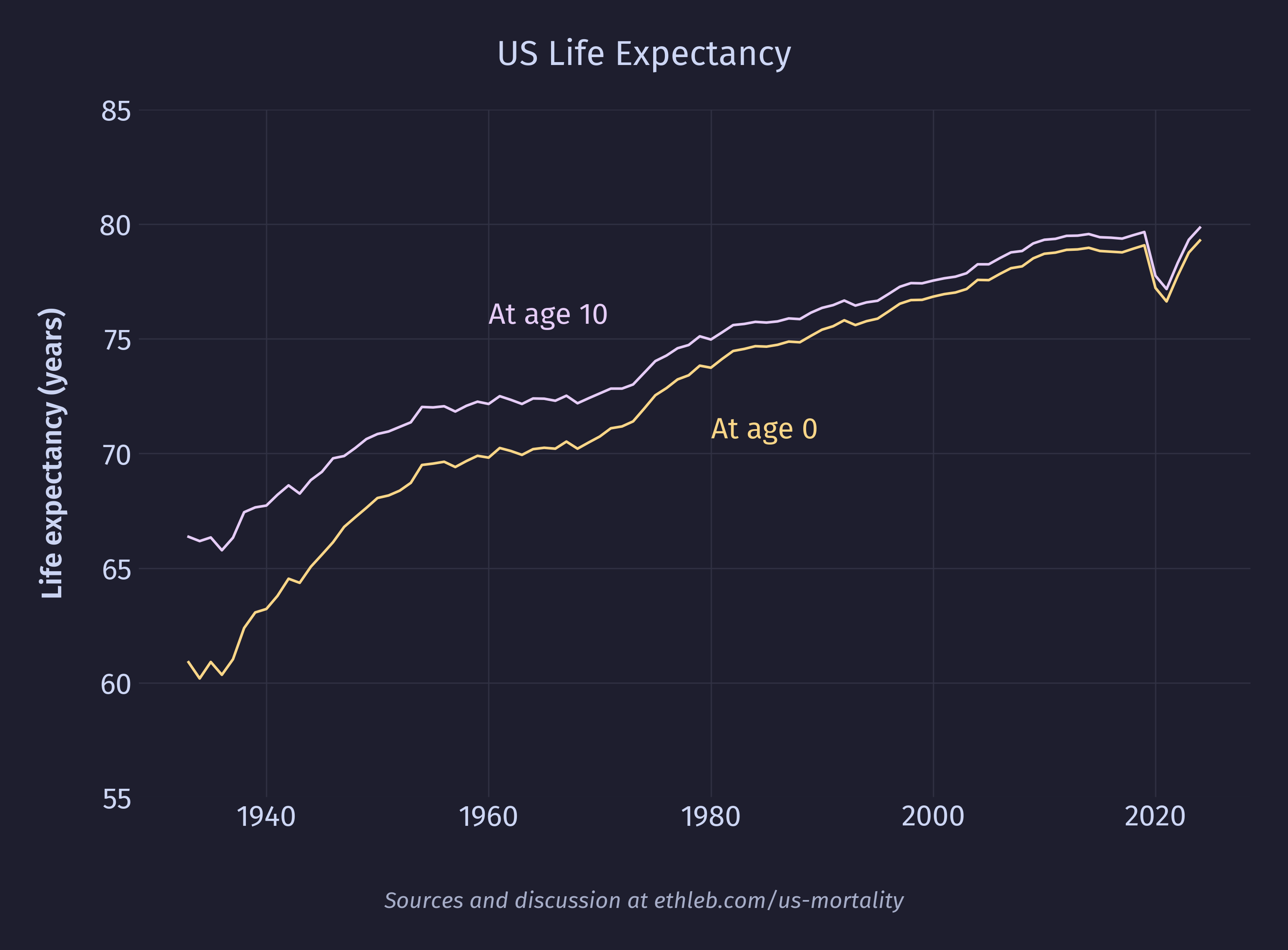
Since the official life expectancy reported by the CDC is based on calculations assuming mortality rates will be held constant at the current values, and since in reality it is expected that mortality rates will continue dropping, the average infant born today will likely live past 79. That is, if we could predict how the mortality rate will change in the future and bake that into the model we would get a different value than the official CDC life expectancy number. As it happens, the Social Security Administration (SSA) does just this! The number they came up with for someone born in 2024 is 84 (86 for females, 82 for males). There are more assumptions baked into this number than the CDC’s, which introduces more sources of uncertainty, which is why it isn’t published as the official number. legalclarity.org explains how this is used:
Life expectancy figures are baked into the math behind Social Security’s benefit structure. The core design goal is actuarial neutrality: a person who claims early, a person who claims at full retirement age, and a person who delays should all receive roughly the same total lifetime benefits if they live an average lifespan.
So what’s causing these deaths?
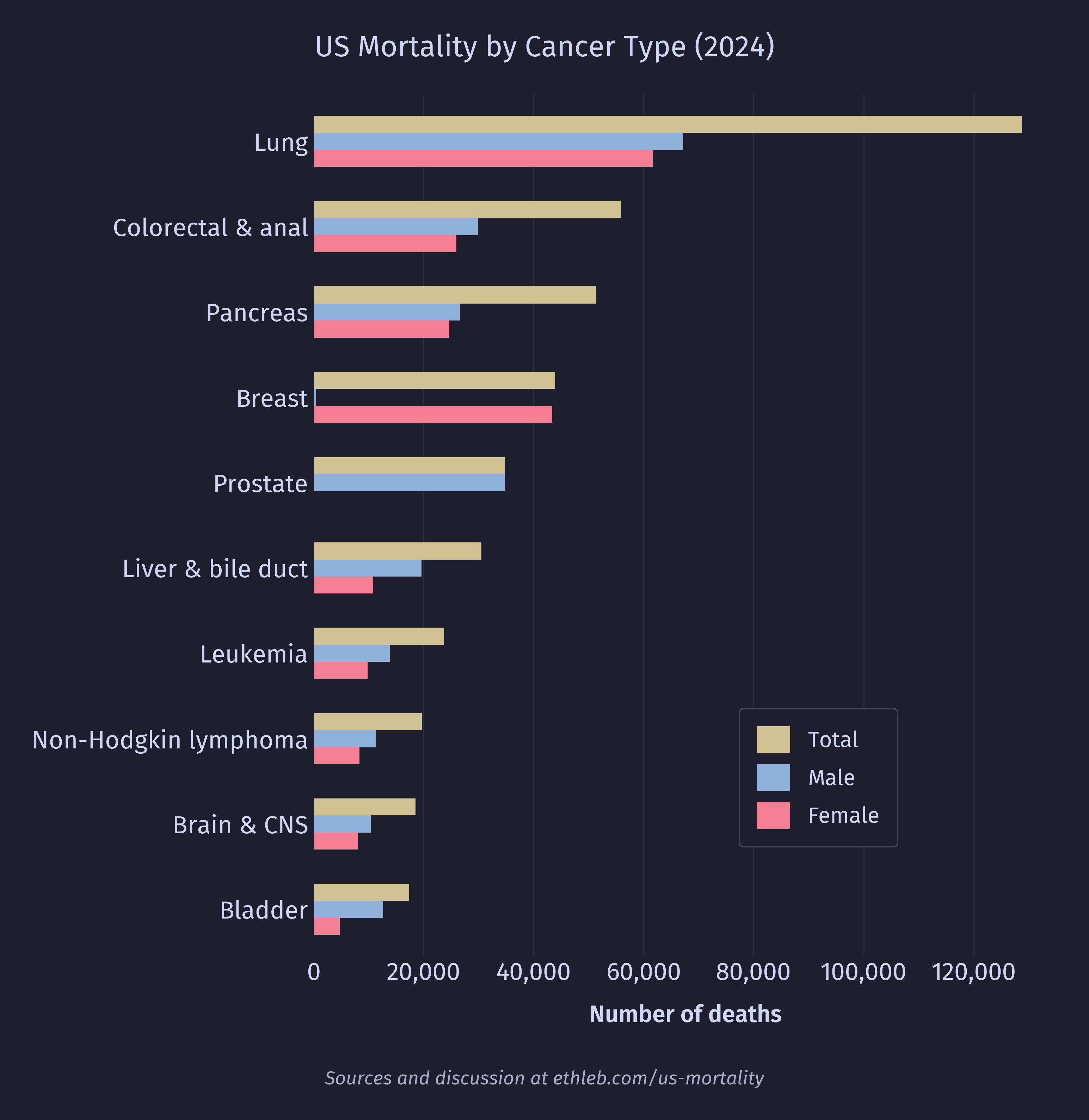
The NCHS provides a set of 52 rankable categories for cause of death. These are categories that aren’t overly vague junk buckets (such as “other”), are mutually exclusive (we don’t want to rank “lung cancer” against “cancer”), and are considered to have some public health value. I will be using these categories out of convenience, and to remain consistent with prior methodology. The number of deaths attributed to the most common 20 of these categories is shown in this chart:
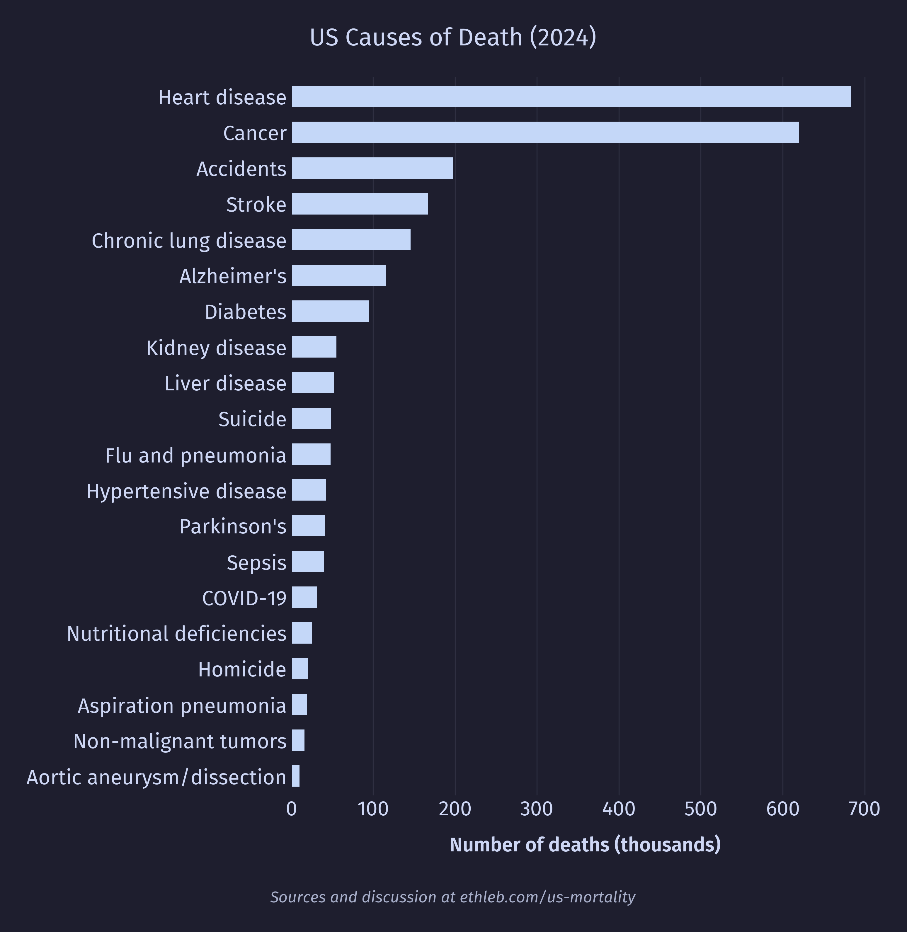
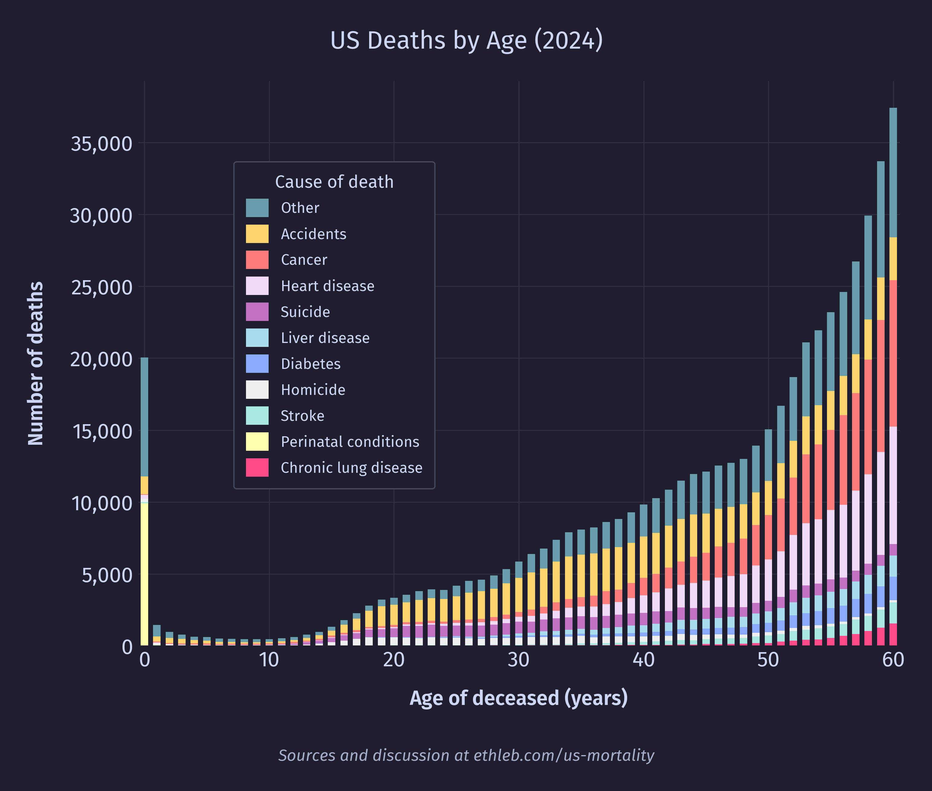
I want to see how causes of death vary with age. To do this I’ll create a new version of the deaths by age histogram, where each bar is split up by cause of death. I have used only the top 10 causes of death for legibility, and everything else has been grouped in “other”. These top 10 causes account for 71% of deaths in the dataset, and 49% of deaths are accounted for by only the top 3 causes (heart disease, cancer, and accidents).
We can also create a new version of our mortality rates (divide by population and multiply by 100,000) by age chart in the same way:
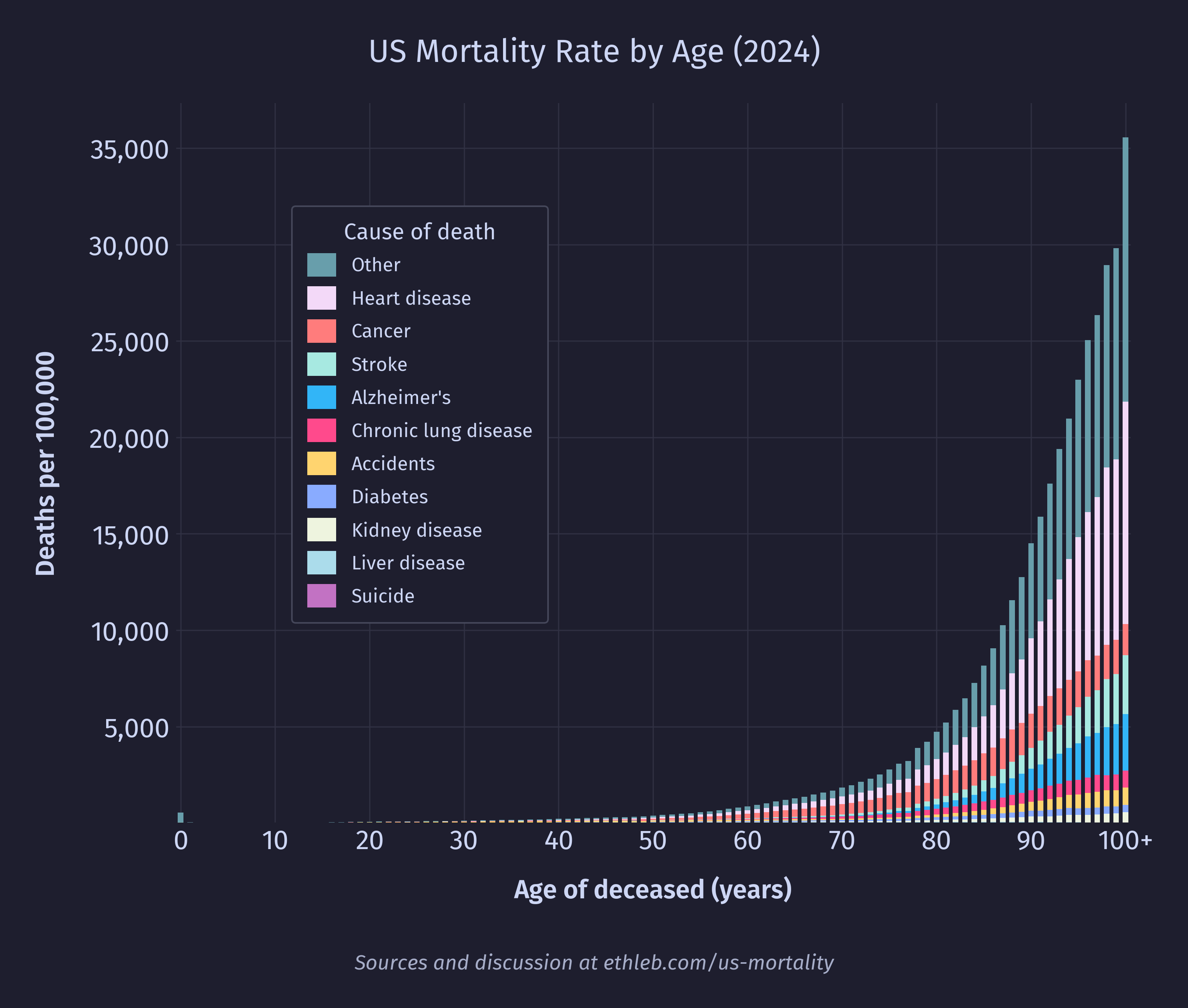
This chart is dominated by heart disease and cancer, which are concentrated in old age. To get a better sense for what drives mortality rates at younger ages we can remake the cause of death per age graph constraining the age to 60 and younger:
This is our headline chart! Since the population is so much flatter under 60, it has much less of an effect on the shape of the data, so the mortality rate by cause chart looks very similar to the total deaths by cause chart while the age is below 60. Since deaths by cause is easier to interpret than mortality rate by cause, I have chosen to go with the above graph for the headline rather than using mortality rates like in the graph below.
Infant mortality
It’s time to finally address that spike of deaths at year zero. What exactly drives infant mortality in the US? Below are the top 15 causes of death in 2024 for people under the age of 1 using the NCHS rankable categories.
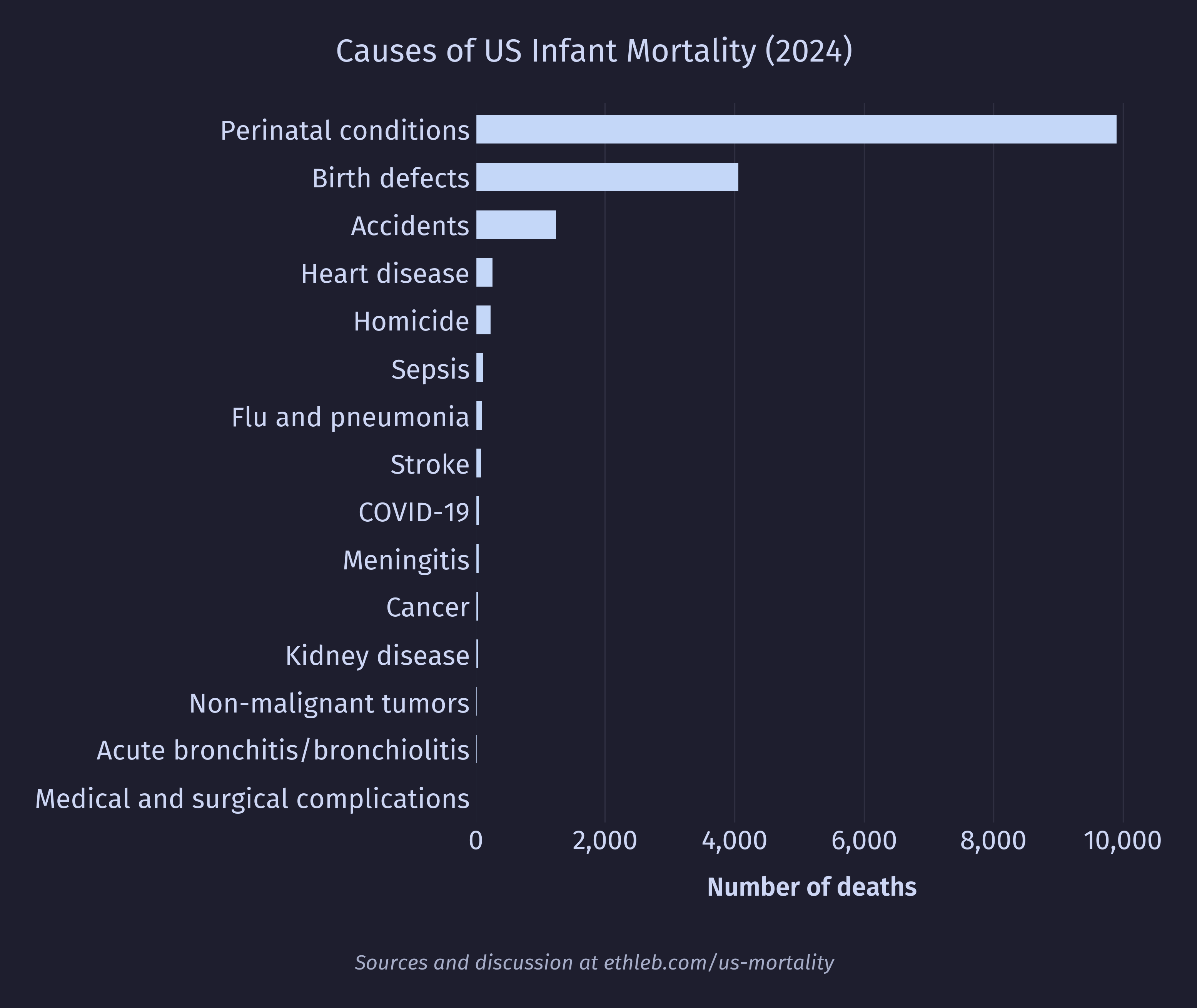
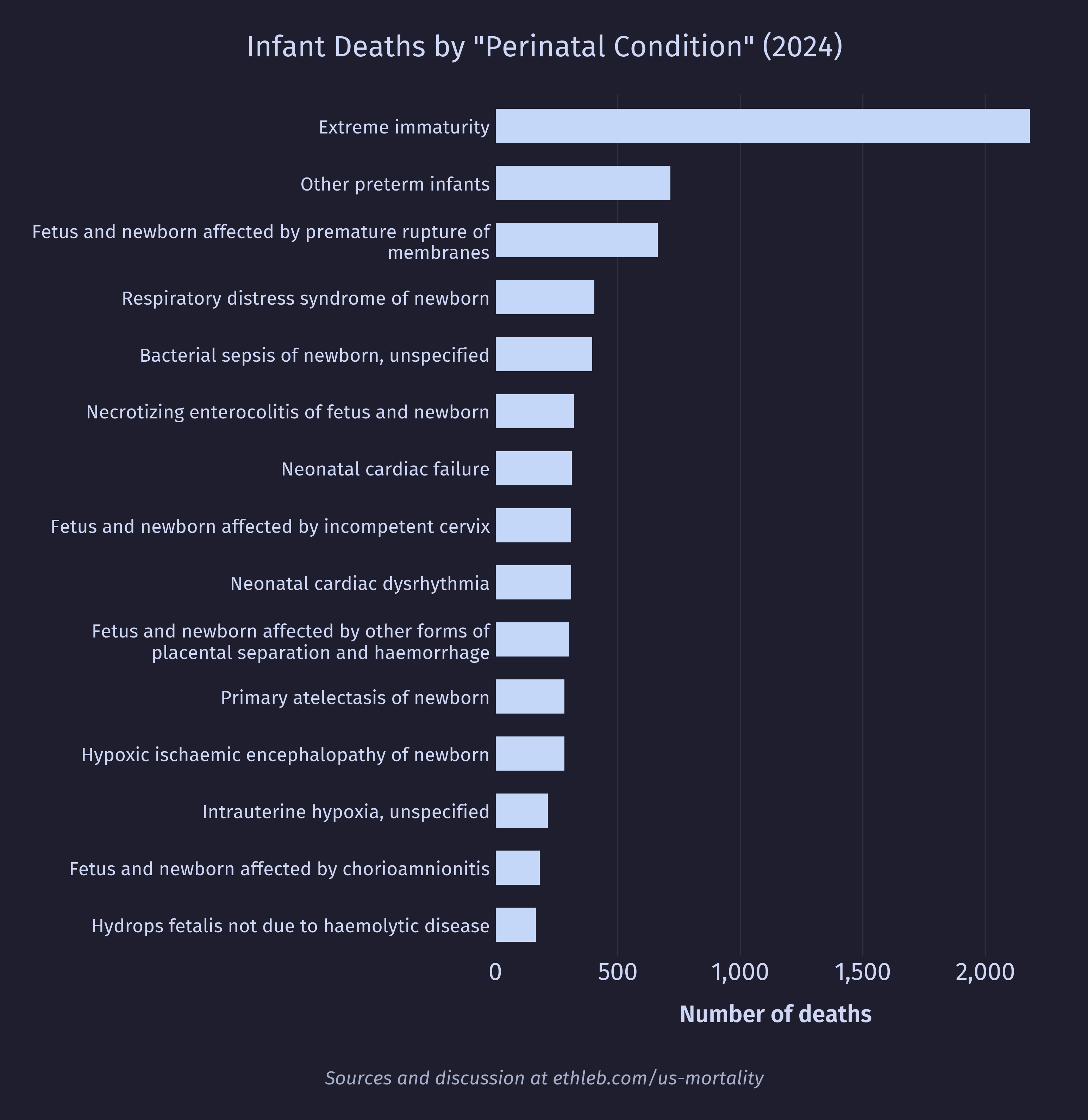
The top two causes of death dominate the infant mortality data but are fairly uninformative. Let’s dig deeper. First, let’s look at the breakdown for conditions originating around birth:
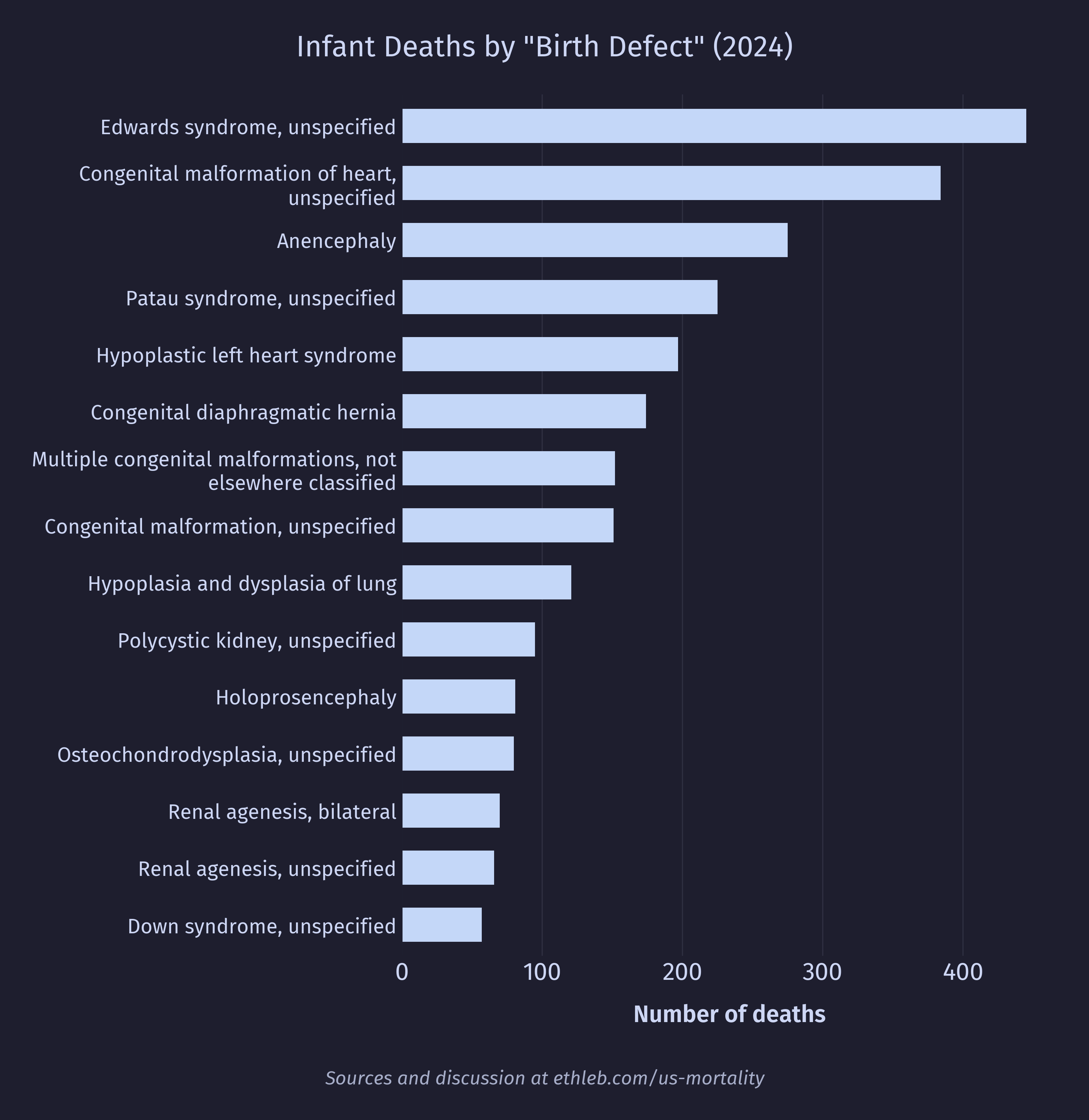
And here’s the breakdown for congenital birth defects:
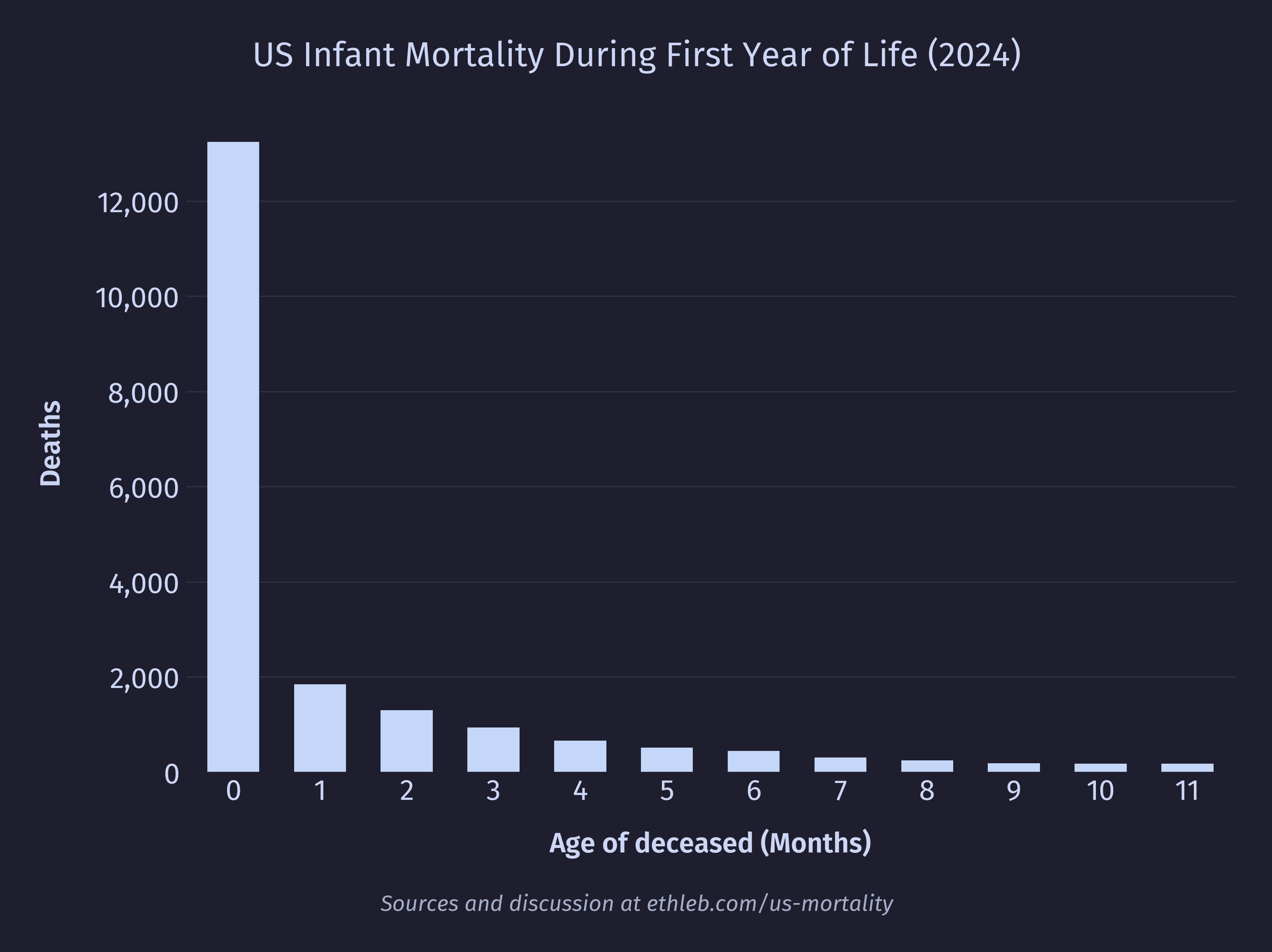
A large driver of death appears to be premature birth, so I would expect to see first year deaths heavily frontloaded. The data reflects this clearly in deaths by age in months:
And also in deaths by age in days for the first month:
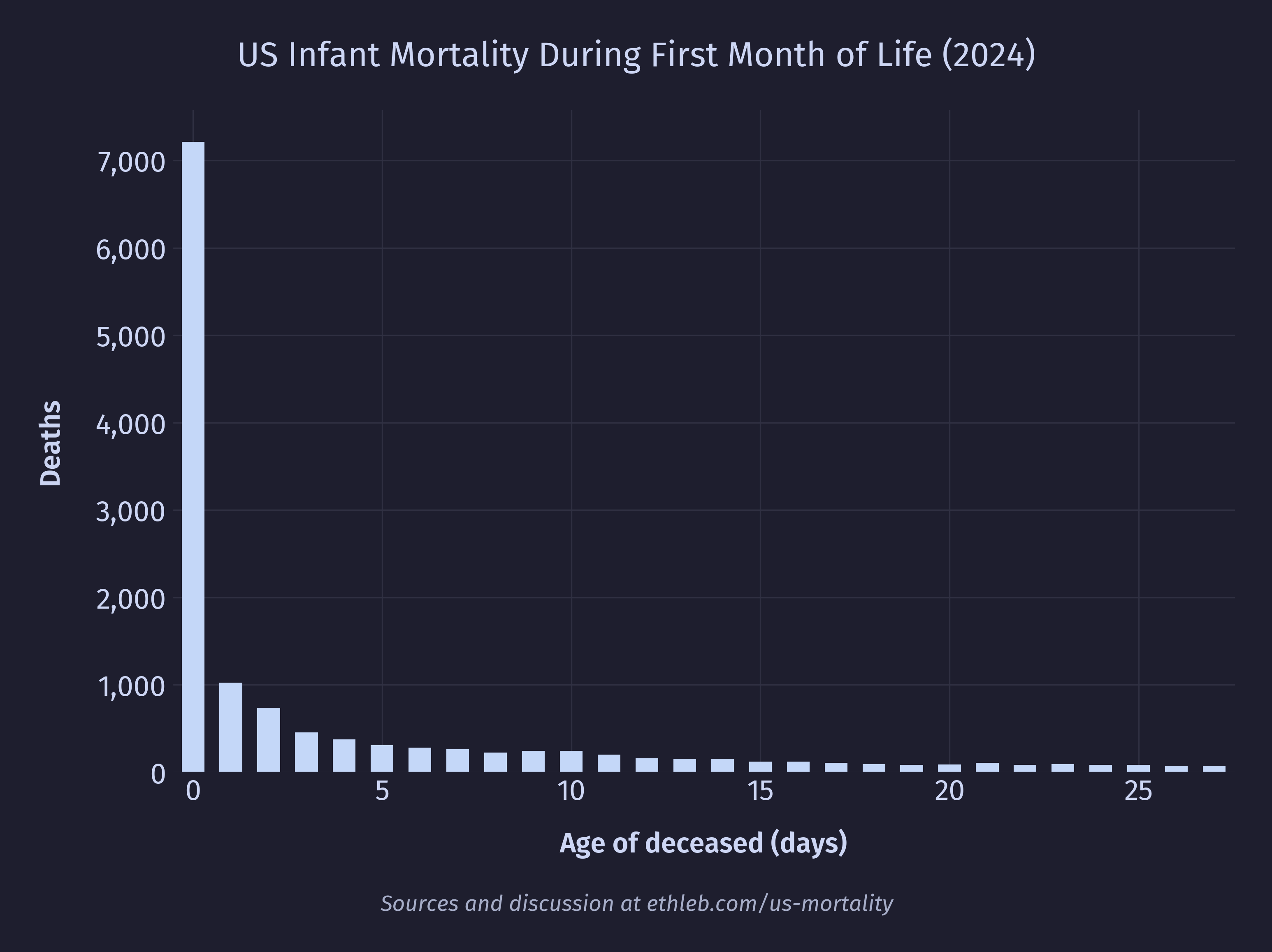
And even deaths by age in hours for the first day:
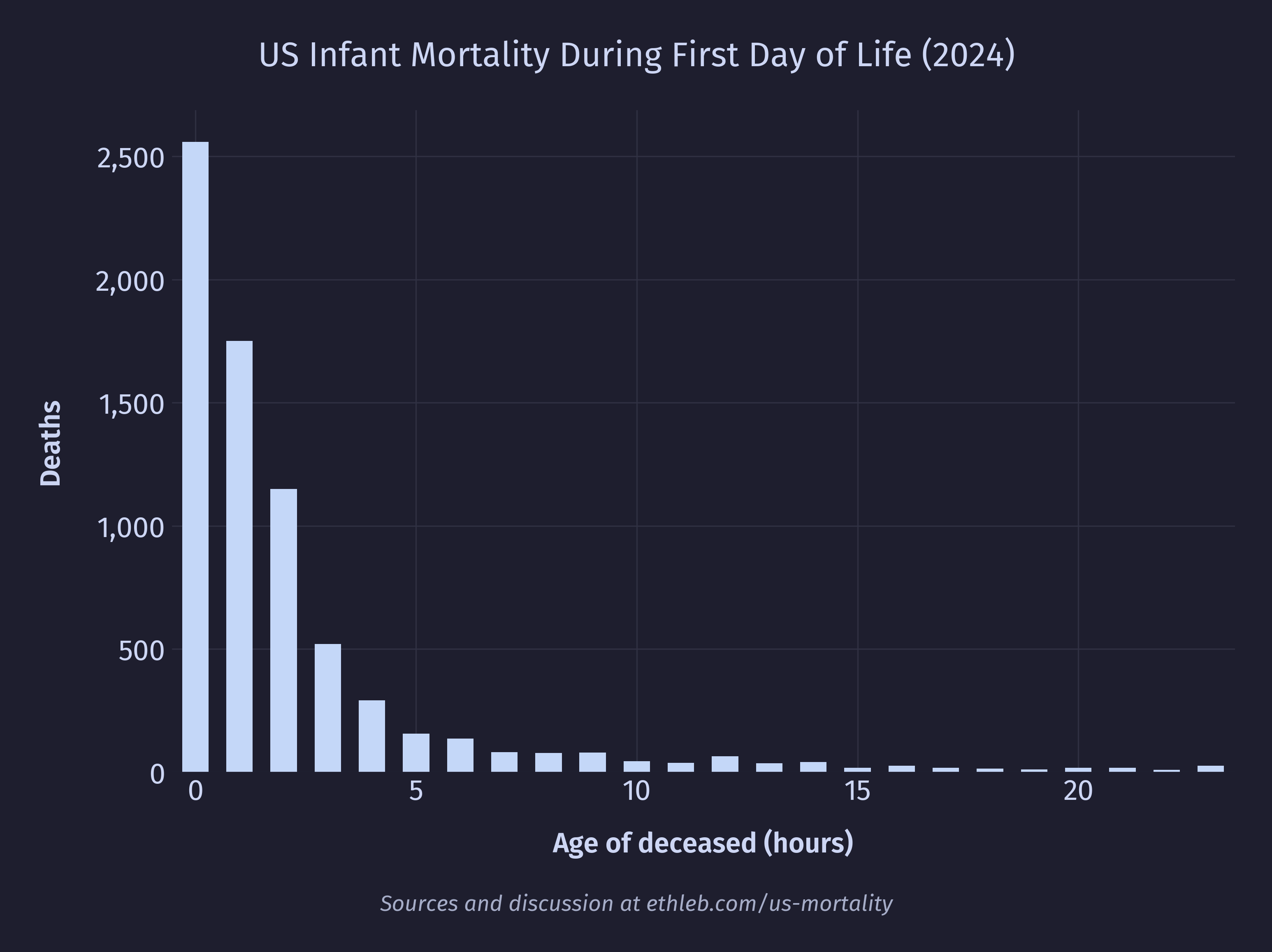
In 2024 over a third of first year deaths in the US happened during the first day.
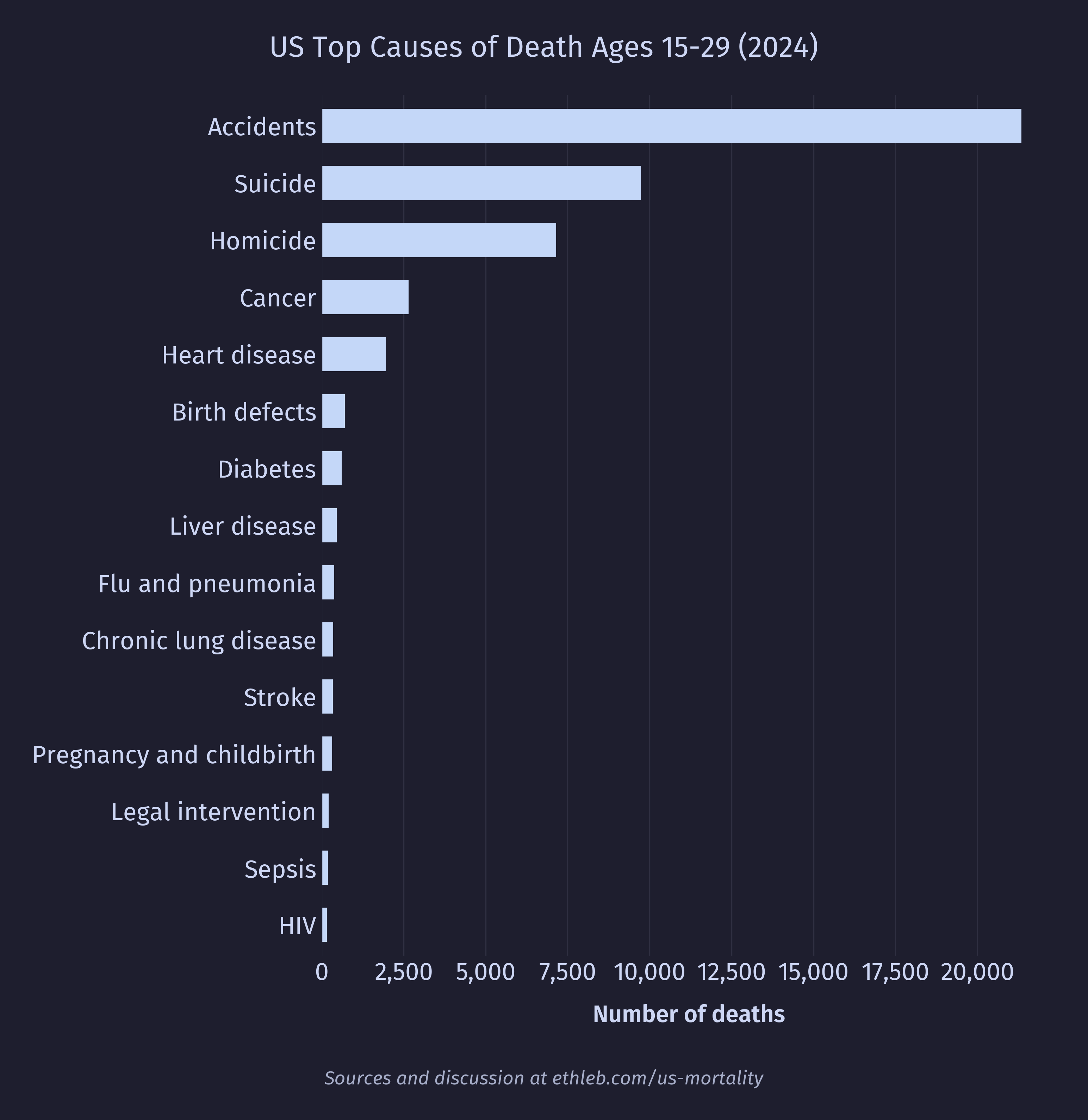
Young adult death
For the purpose of this analysis I have categorized young adults as ages 15-29. I consider this a conservative range to crop out the dangers of infancy and age. These are the top 15 causes of death for young adults:
And here is the sex breakdown constrained to the top 10 causes for legibility:
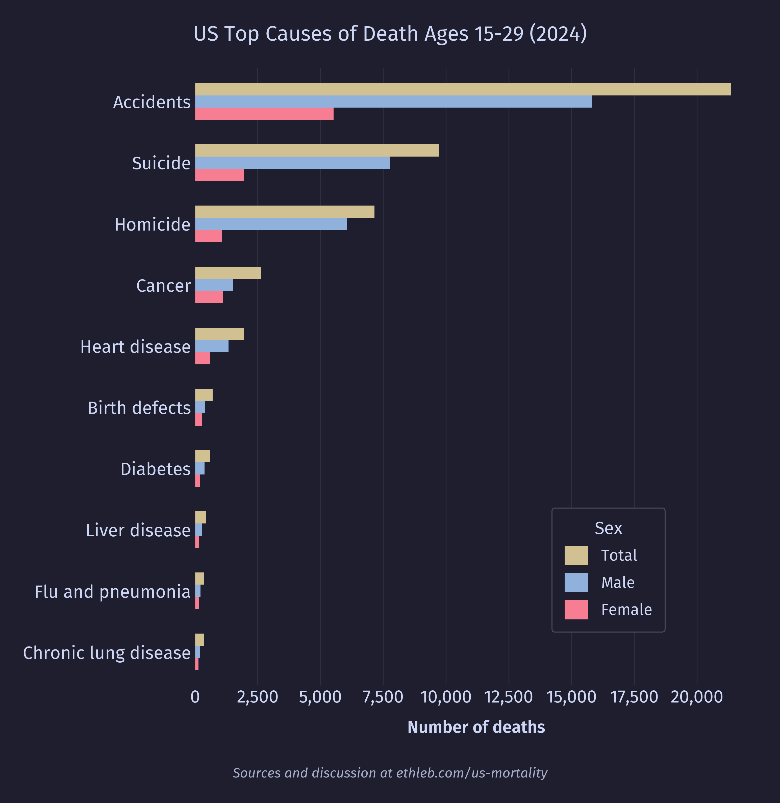
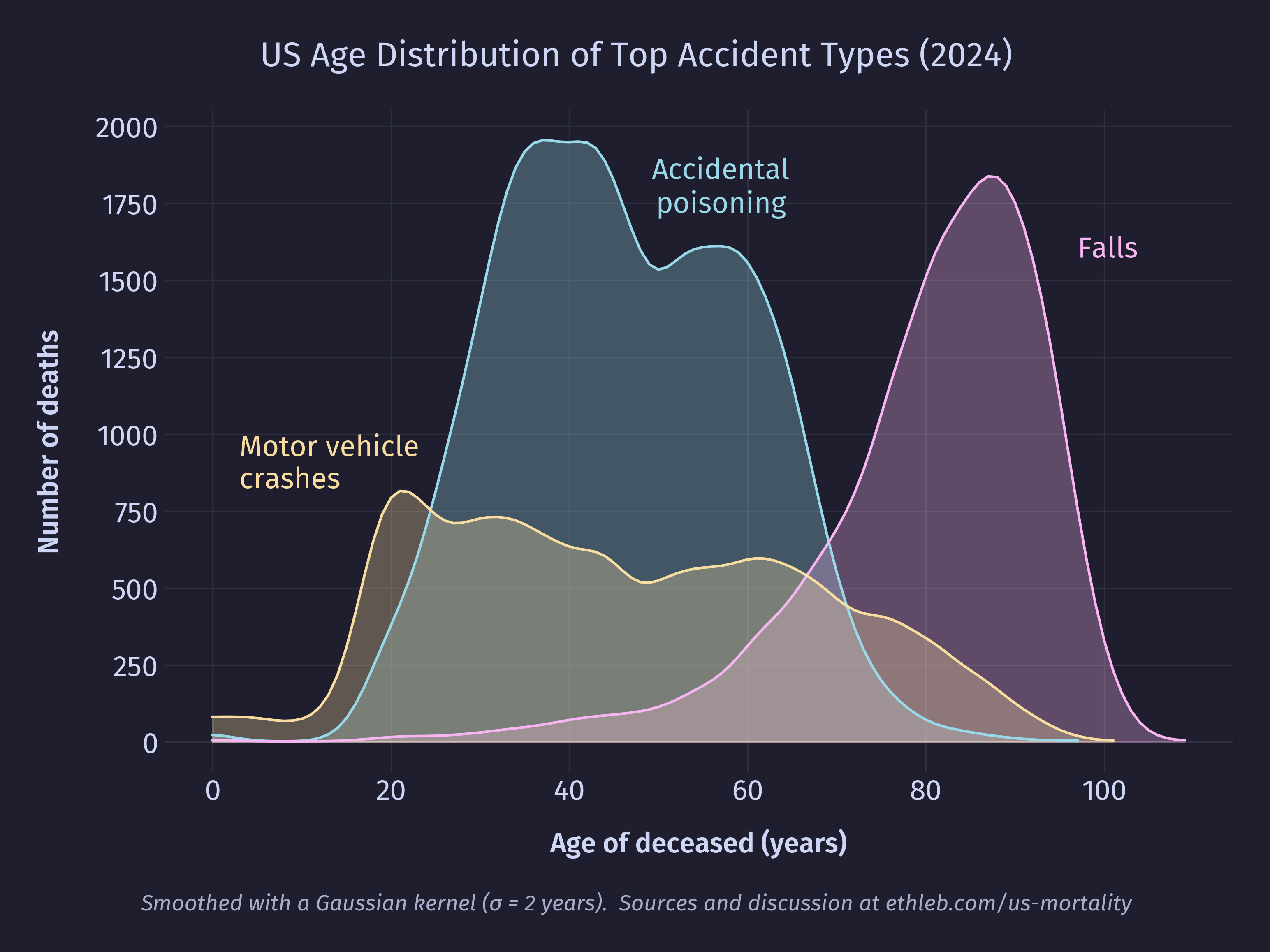
By far the dominant cause of death for this age group is accidents. Let’s take a closer look at this category:
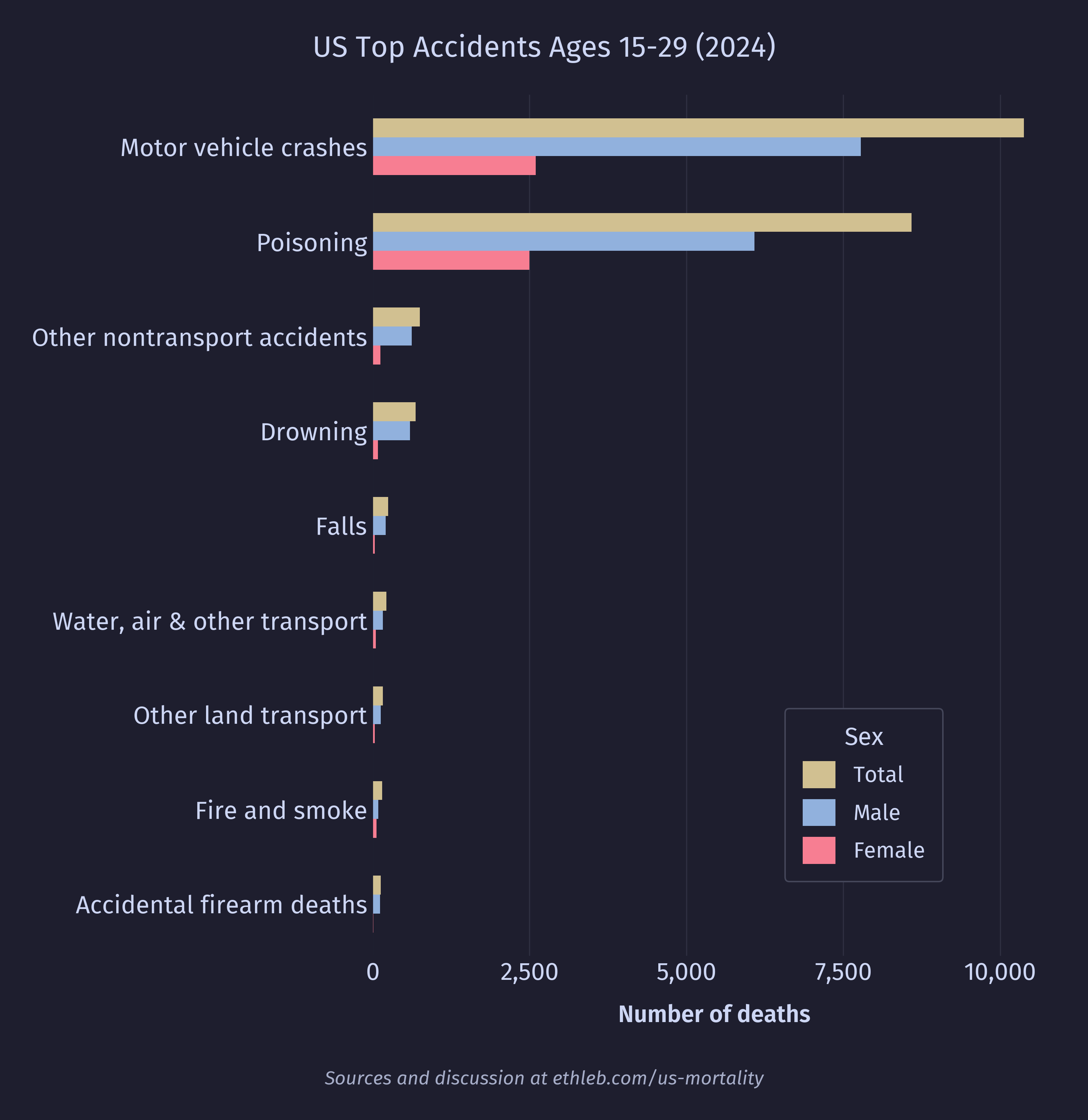
Now we can see that accidental poisonings (mostly drug overdoses) and motor vehicle accidents are largely what drive the high accident numbers for this age group. Accidents remain a top cause of death for every age group, but the type of accident is extremely age dependent. Here is the distribution of the top three most common types of accidents:
Let’s take a closer look at the poisoning deaths. For this chart I have included data for the entire population, not just young adults.
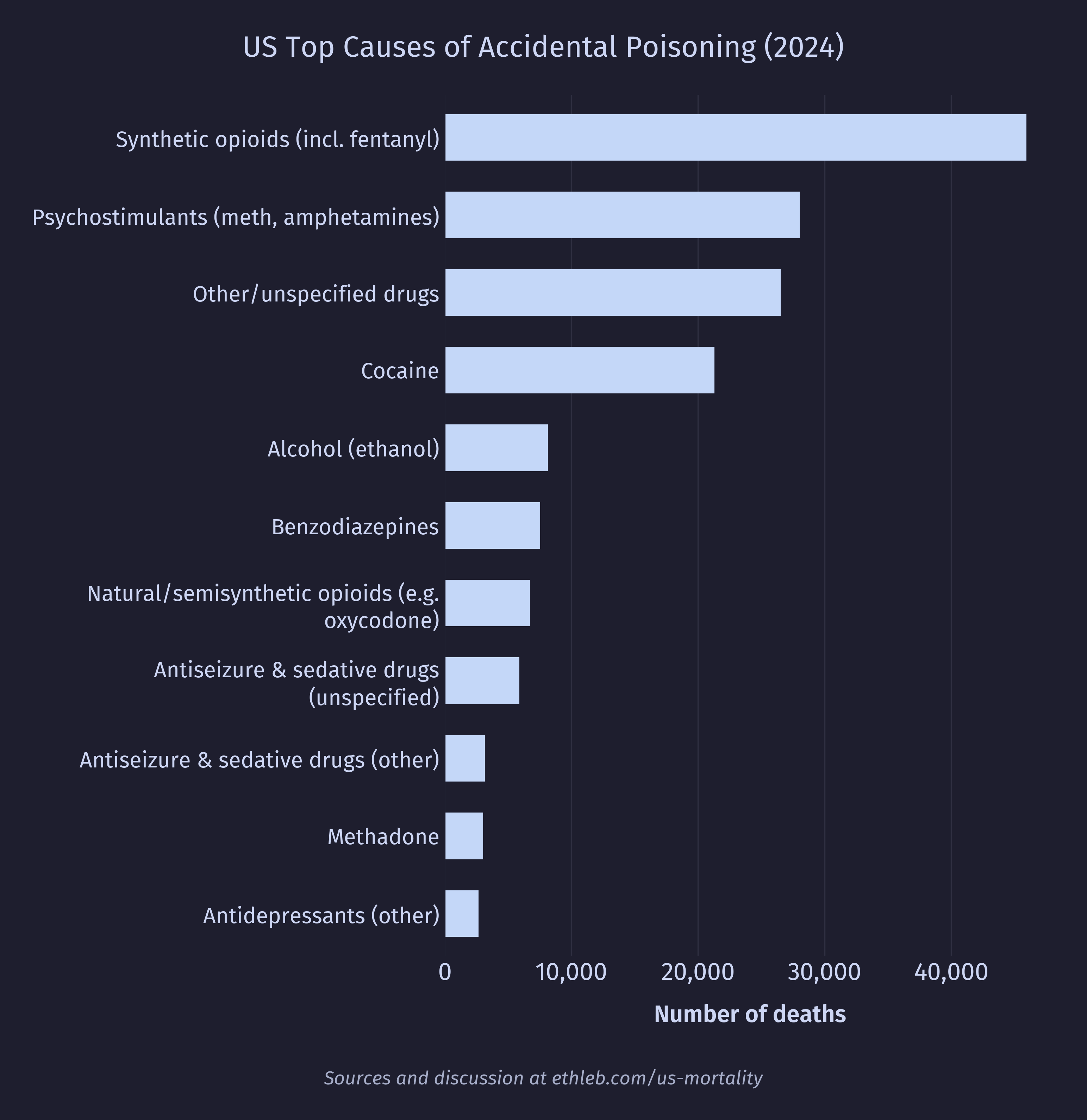
It’s no surprise to see synthetic narcotics (which includes fentanyl and its analogues) at the top. It should be noted that a single death may have multiple substances listed in the mortality data. I hope to do a much deeper dive into drug related mortality, morbidity, and usage statistics in a future project.
Cancer
This is the distribution of cancer deaths by age cropped to exclude data from deaths over the age of 60:
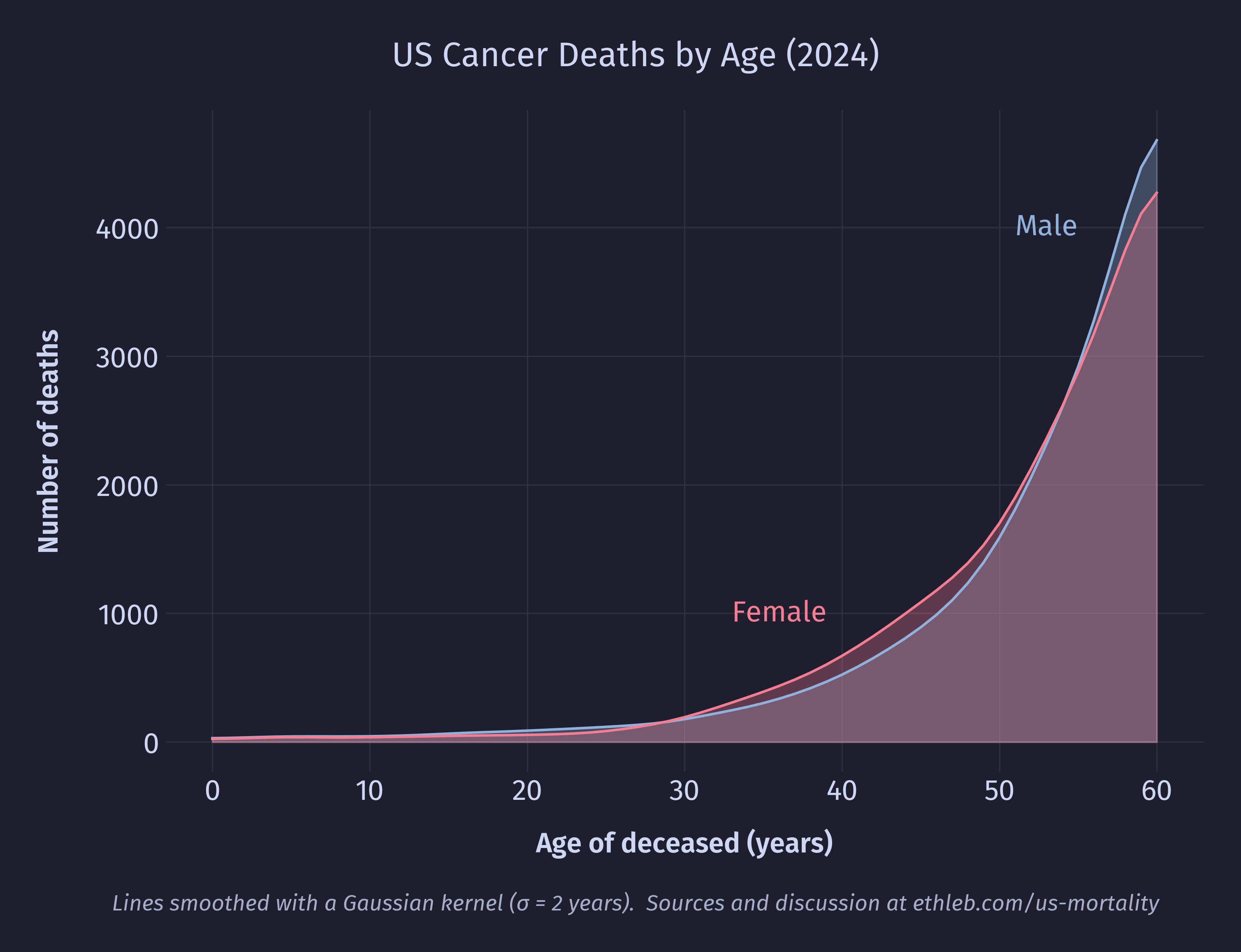
Cancer is one of the few top causes of death higher for young to middle aged women than men of the same age group. I’m curious how sex specific cancers (such as breast, testicle, and prostate cancer) balance against one another in the statistics. Here is the breakdown of cancer types among 30-50 year olds for each sex:
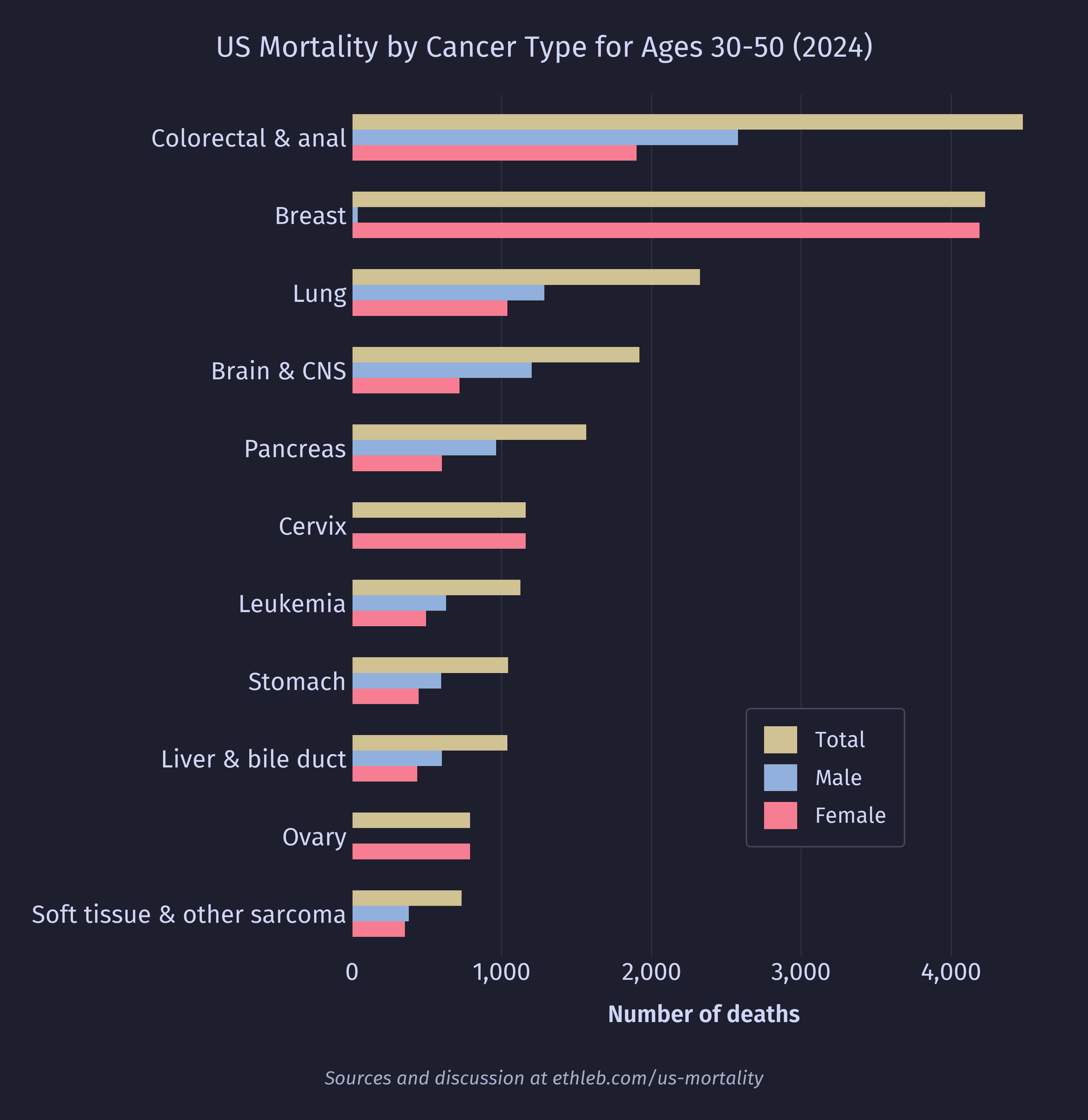
As it turns out, breast cancer deaths are very lethal in this age group, and there are also a few other cancers specific to female anatomy that drive the mortality. Testicular cancer deaths are quite rare compared to breast cancer, with only 234 deaths in the age group, and only 465 in the entire dataset. Prostate cancer turns out to be extremely age dependent. There were only 125 deaths from prostate cancer among the selected age group, but 34,861 prostate cancer deaths in the whole dataset. When we remake this chart using data for all ages, we see prostate cancer jump to the 5th position.
Violent Deaths
We’ll end this analysis with a very brief look at violent death (suicide and homicide). I’m curious how rates of violent death vary across age groups. I hear a lot of dialogue about mental illness among teens, so my expectation going into this was that rates of violent death will be elevated for teens and young adults.
This chart shows the distribution of violent deaths across the age of the population. I am once again dividing by the population of each age group and multiplying by 100,000 to get the rate of death per 100,000 people. The solid line has been smoothed to emphasize the overall distribution of the data. The faint dotted lines are the raw unsmoothed values.
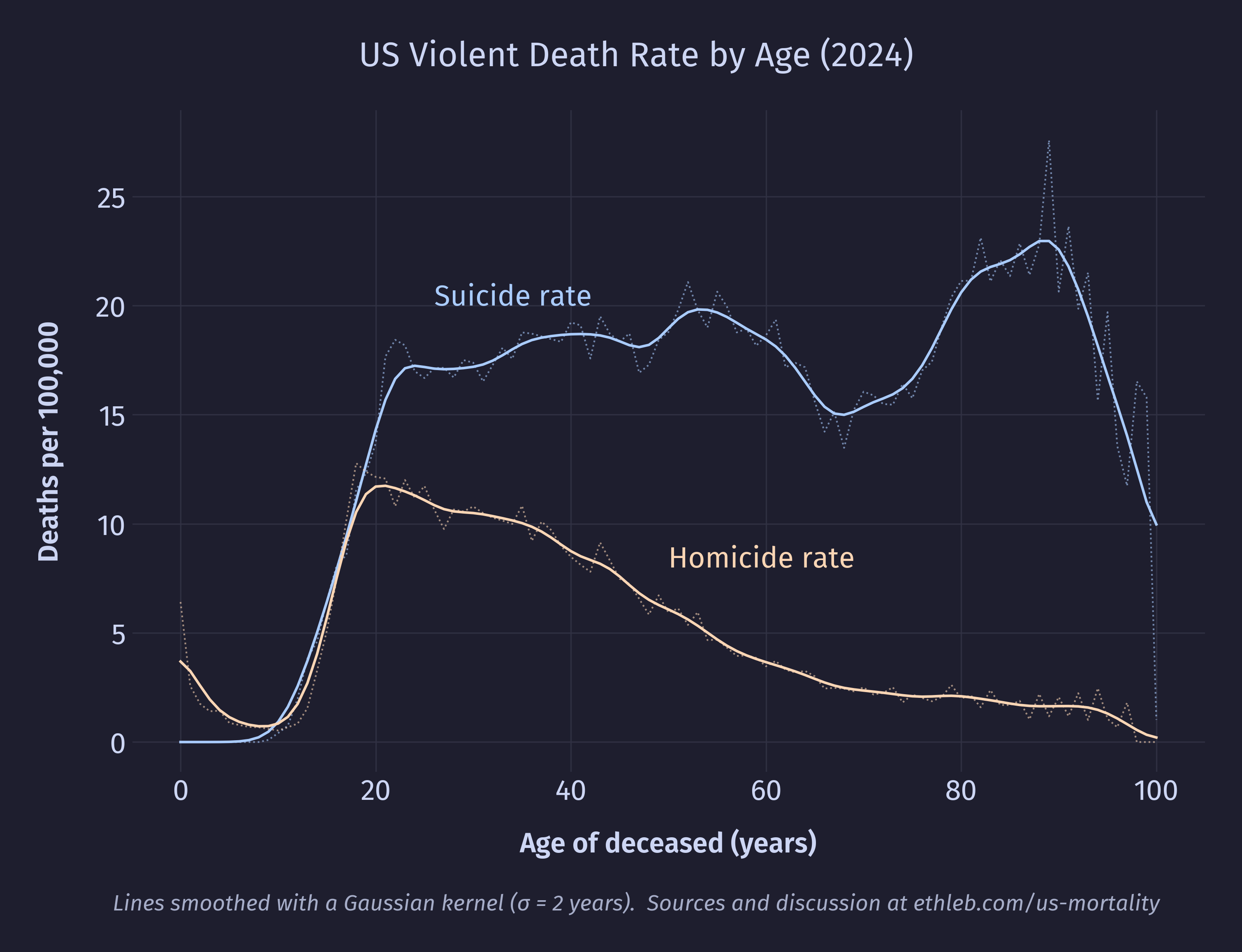
To my surprise, suicide rates begin rising during teen years but then remain elevated for the rest of life. In fact, suicide rates are higher in the 30s and 40s than they are in the teens and even the 20s! This implies that the perception that suicide is especially common among teens is less a product of teens actually committing more suicide and more a product of teens just not dying other ways. That is, suicide is salient among the age group because it’s one of the few ways they actually die. So a high suicide rate isn’t the defining factor of teen mortality, low mortality rates for almost every other cause is. This is good news!
Violent death rates turn out to be extremely sex dependent. Here is the suicide rate split by sex:
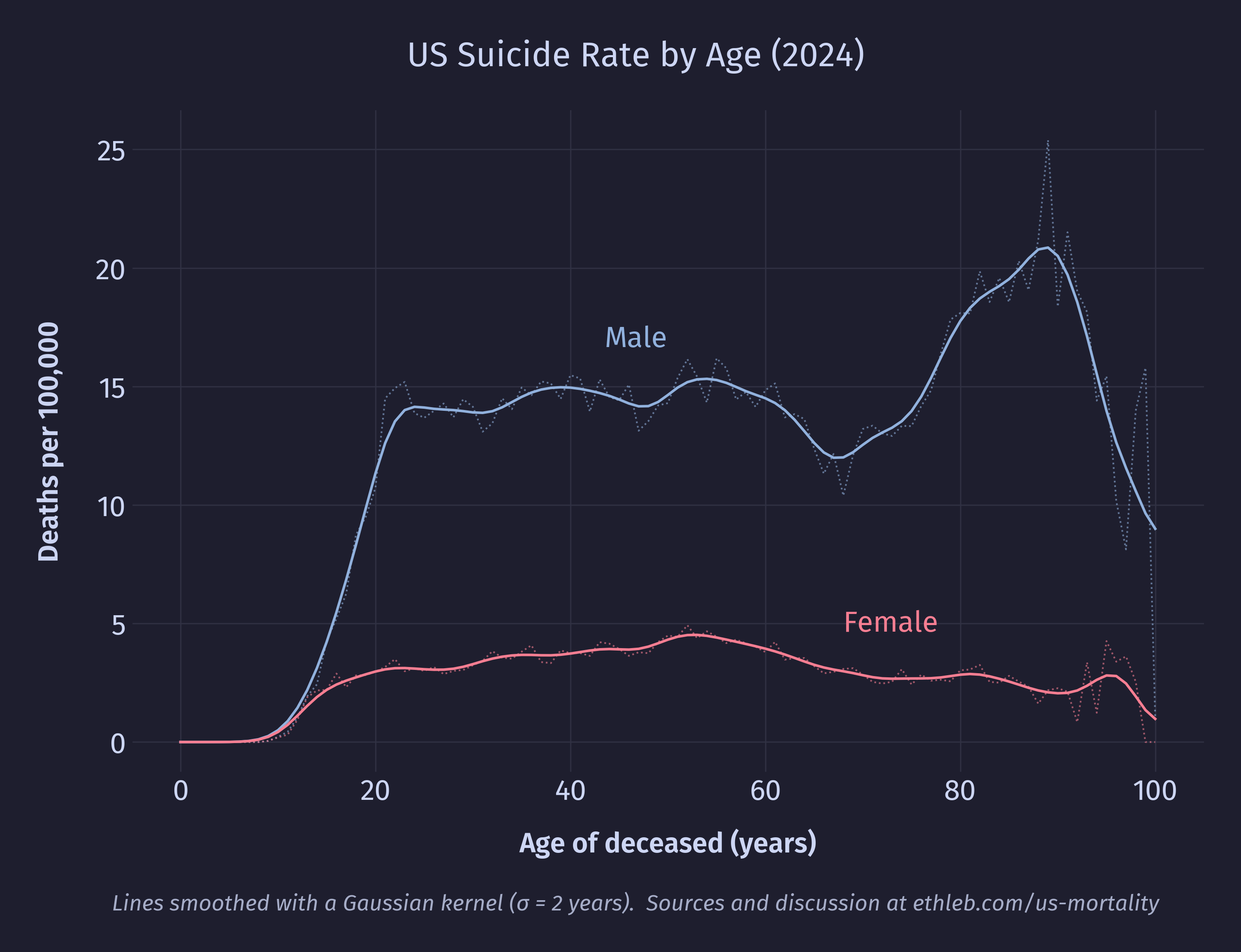
Males have consistently higher suicide rates compared to females starting in the teenage years, and the increased male suicide rates in late life is exclusively responsible for the spike in total suicide rates for that age group. In 2024, four out of every five suicides were male. The homicide data tells a nearly identical story, with males comprising four out of every five victims of homicide:
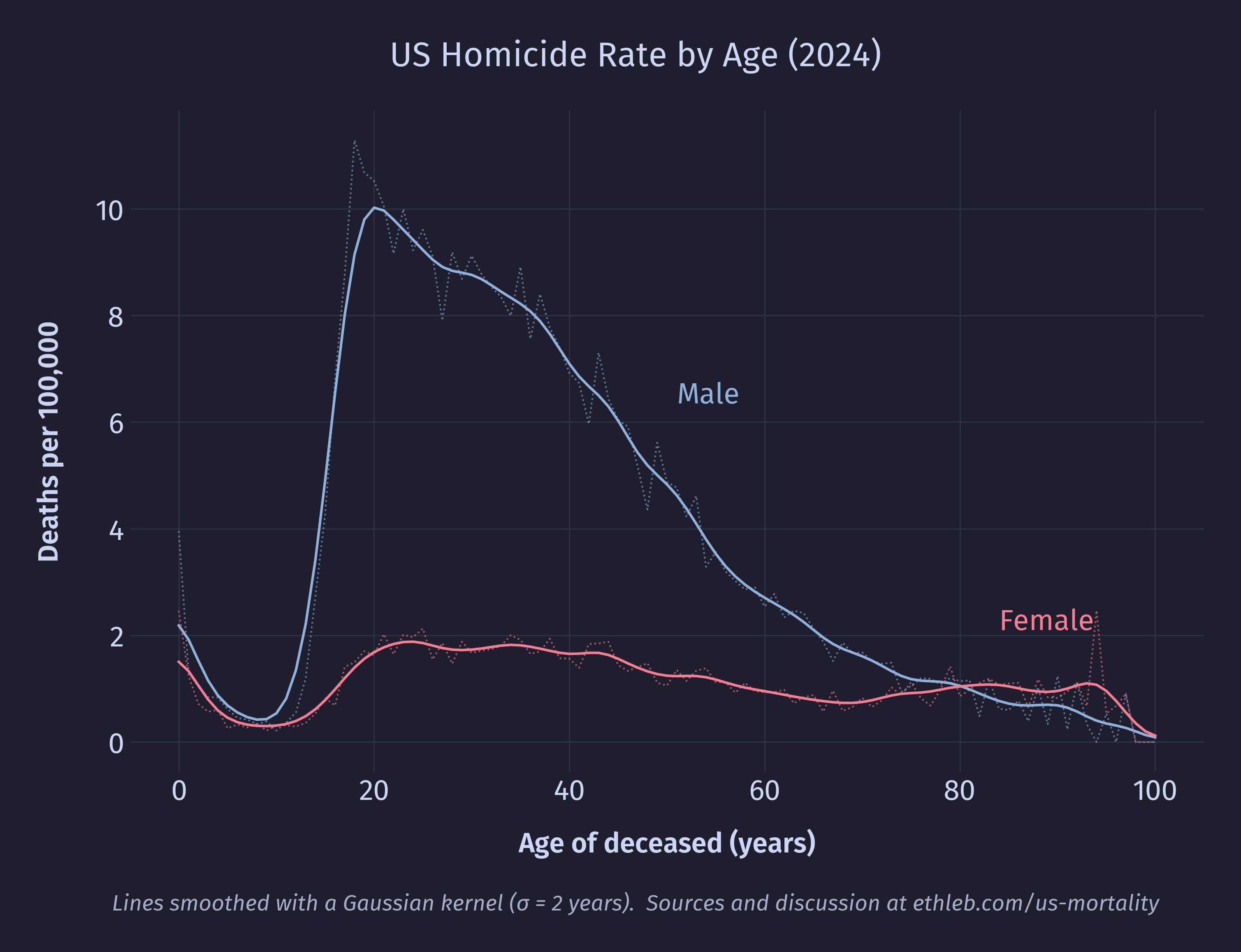
In contrast to the suicide data, the homicide death rate among males drops steadily after a peak age around 20 years, and even briefly drops below the female homicide death rate late in life (though here the values are low, the sample size small, and the data noisy).
Conclusion
In making this project I feel like I covered a lot of ground, and simultaneously only scratched the surface. Every question I answered opened the door to so many new ones that I didn’t have the time or space for in this analysis. I feel much more comfortable doing exploratory data analysis in Python now than I felt at the beginning of this project, I feel better at making effective visualizations, and I learned about topics I didn’t even expect to touch.
I find that looking at mortality through the lens of data did a lot to sterilize the topic, and stripped away much of the emotion. It reminds me of a line often misattributed to Stalin: “The death of one man is a tragedy, the death of millions is a statistic.” I know people who would discard statistics because of this, saying it misses what’s really important. There is some real risk of this. The data holds nothing of what it’s like to lose a loved one. No matter how I pull it apart, visualize it, or model it, it will never reveal what it means that people die, or how to live as someone who will.
But I don’t think abandoning statistics is the right response. Florence Nightingale is considered the founder of modern nursing and a pioneer in data visualization and storytelling. During the Crimean War she became famous for checking on wounded soldiers in the hospital late at night and was given the title “The Lady with the Lamp”. Later in her career she extensively used the visualization of mortality data to campaign for health reform. There is no contradiction here. She cared about people, and used statistics to help them. It may be true that the data obscures the tragedy of individual death and the grief that follows, but it is also true that it can help us learn how to better care for the living.